How to Use Excel to the Fullest (Data Analysis & Making Scientific Plots)
Excel is an excellent tool for analyzing your data or creating plots. We have created a guide for how to use excel as a reference for you.
Well-drawn graphs are an essential tool for quickly and easily understanding a body of data collected for a report. “A picture speaks a thousand words” certainly holds true and the time taken to carefully prepare a graph can save a considerable amount of effort in writing and explanation on your part. For those who read your report, a good graph will help them to easily understand the ideas you are trying to communicate. In an academic laboratory such as this, confusion of your audience can result in only one thing: a lower grade!
The following illustrate two examples of graphs created by two different methods. The first graph is generated using Microsoft Excel (see how to use excel for further information). The important aspects to consider when preparing such graphs are indicated in italics.

You will be provided with several opportunities to train and improve your skills using Excel as the semester progresses. Since the computer handles drawing the line of best fit and the generation of the resulting equation you may find it beneficial to consolidate two or three graphs onto a single page. Just make sure that all of the important information is there for each graph and still easy to read and interpret once it is printed.
The second type of graph is one drawn by hand. Again, items of importance are described in italics.
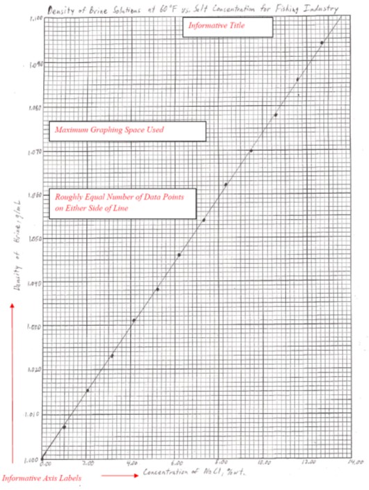
Hand drawing a graph is more challenging than using a computer program, but there may be times when you have no option (no computer access, power outage, etc.) or want the detail only a hand drawn graph can provide. When drawing a graph manually there are several important considerations:
- The best-fit line drawn must represent an average of the points. In genera,l this means that there should be roughly an equal amount of data points on either side of the line drawn. It is NEVER appropriate to “join the dots” on a graph.
- Use as much of the page of graph paper as possible for a single graph. By using the full sheet of graph paper, you can extend the axes to take advantage of as much resolution as the page will allow. Note that sometimes it may be useful for this purpose to start an axis at a point other than zero.
- You will have to generate the equation for the line yourself. Remember that you need to use two points on the line, not two data points, to calculate the slope. The y-intercept is determined from where your line intersects the y-axis.
Interpretation of a graph varies from experiment to experiment, from data set to data set. Typically, there are two important values to consider and understand in linear relationships:
- Slope: The slope of a line gives a direct relationship between the information content of the x-axis and y-axis. Understanding this relationship can provide new insights to your data.
- Y-intercept: The point at which your line crosses the y-axis can have relevant information about a nul state for your data set. Depending on the data being processed some lines are meant to pass through the origin (0,0) and others are not. Be sure you understand what the y-intercept means in relation to your data.
You will be expected to present your data graphically throughout this laboratory course. UW Madison Information Technoloty offers training and workshops for all sorts of software offerings on campus. Visit the UW-IT website for more information.
Be aware that the computer knows little of good graphing technique as it applies to chemical science. You should not necessarily accept the first graph the computer displays. Your graphs will be graded according to how well they conform to the standards of good graphing technique enumerated above. You will need to know how to complete the following tasks in Excel:
- Add a title to the graph.
- Add labels to the axes.
- Calculate and display the best straight line for your data set (calculate the slope).
- Calculate and display a statistical measure of how well the line represents the data. (You should look to see what is calculated in the program you decide to use. Terms like “linear regression”, “R2”, and “correlation coefficient” are commonly used to provide a statistical measure of how well a line represents the data.)
- Customize the type of graph displayed and remove any lines that are present that “connect-the-dots” (or “connect-the-data points”).
- Perform a mathematical operation on an entire column of data (i.e., convert data set A, {A}, to ln{A}).
Instruction for making a plot in Excel
- Enter your data into the spreadsheet columns. The first column represents the data for the x-axis, the second for the y-axis.
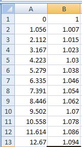
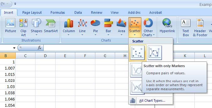
- Then, under the insert menu, select “Scatter with only Markers”.
- Your chart will be displayed along with a series of chart tools to the right of the primary menu. Under “Chart Tools – Design – Chart Layouts” Select “Layout 1” to give a chart with text boxes for a title and axis labels.
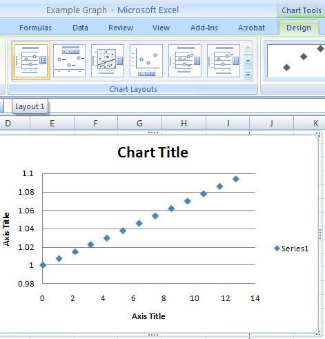
- Delete the Series Label on the right, and the gridlines on the y-axis (simply select the item in question and press the delete key). Double click on the chart or axis title to gain access and insert relevant information.
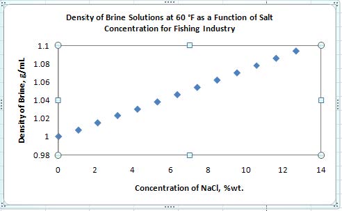
- Click on one of your data points to select the series, then right click and select “Add Trendline”. For the trendline options, make sure “linear” is selected. Also, check the boxes at the bottom labeled “Display Equation on chart” and “Display R2-value on chart”. Click the “Close” button at the bottom of the menu.
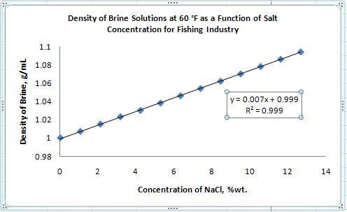
- In order to get the R2 value to display to four decimal places, select the equation box, right click and select “Format Trendline Label”. Under the “Number” tab, select “Number” and change the “Decimal places” to 4.
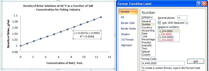
- If you wish for your chart to appear on a unique page, right click on the chart, and select “Move Chart”. In the resulting window, select the button that says “New Sheet”. Otherwise, you may resize and position your chart as you see fit. Remember you may print more than one chart per page as long as the information is legible.
Please use this form to report any inconsistencies, errors, or other things you would like to change about this page. We appreciate your comments. 🙂 (Note that we cannot answer questions via the google form. If you have a question, please ask your instructor or TA.)
