3 Lesson 3
Welcome to the
Scale and Spatial Statistics with GIS
In this lesson, you will:
- Review concepts and considerations of scale
- See examples of how scaling issues can affect conservation planning
- Learn when and why we might apply spatial statistics in GIS
- Learn how to conduct exploratory spatial data analysis (ESDA)
- Distinguish different kinds of spatial statistics
- Explore and apply spatial statistics tools in ArcGIS
- Identify basics of spatial estimation (interpolation) and neighborhood statistics
Lesson Topics
This lesson will cover three topics and take approximately 50 minutes to complete. We recommend working through each topic in the order in which they are listed below.
Topic 1. Scale Concepts and Considerations
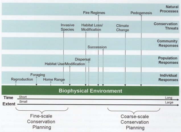
Developing successful long-term strategies for environmental protection or management requires explicit consideration of biological and ecological patterns at different scales.
Species differ in their size, mobility, physiology, and life history, and each responds to the same physical setting in different ways and at different scales. So the analysis scale appropriate for one species is rarely fully appropriate for others.
Examples of Scale Issues in Conservation Planning
Invasive species
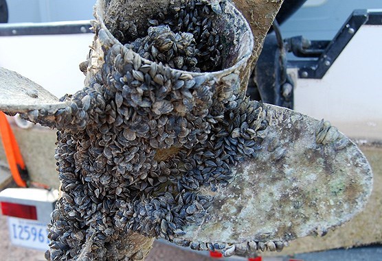
An invasive species like the zebra mussel, which attaches to boat hulls, for example, may appear small, rare, and patchily distributed at the local scale of piers and harbors, yet a large, continuous mass at the regional scale of the Great Lakes. Using only local-scale data, one would conclude that this species is of little conservation importance, but the regional data would suggest it to be a huge pending threat.
Monarch butterfly
At fine scales, small flower gardens with milkweed and nectar plants provide rich habitat for monarch butterflies. Yet at broad scales across the Midwest, loss of milkweed in agricultural landscapes from pesticide use and intensive farming, puts monarch habitats at risk.

Whooping cranes and Siberian cranes
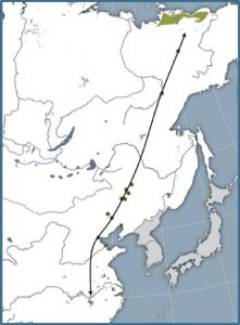
Our large white cranes provide another multi-scale example. Both the endangered Whooping crane of North America, and the critically endangered Siberian crane of Asia, have specialized local wintering habitats like Aransas National Wildlife Area in Texas for the Whoopers, while their migratory flyways between wintering areas and summer breeding grounds, cross continental scales with important stopover habitats along the way.

Sampling Design for Spatial Analysis
As in any ecological study, sampling design is a key step in testing ecological hypotheses in a spatial context. To obtain meaningful insights about the ecological processes, sampling design must:
- define the spatial and temporal domains of the process under investigation
- determine the spatial and temporal resolution that the sampling is able to capture
- ensure that the spatial and statistical analyses are appropriate for the data type
Design of an optimal spatial sampling scheme requires a balance between samples that are too close together (not providing enough new information, highly auto-correlated) and samples that are too far apart (introducing too much variability).
In the next few pages, we will explore how sample size, spatial resolution (grain and extent), spatial sampling design, and spatial lag can affect the identification of spatial patterns.
In spatial analysis, the choice of sample size ‘n’ should be guided by the minimum requirement for subsequent spatial statistics and analysis. In cases where the spatial pattern is very strong, it may be detected with as few as 20 sampling locations (though this would be exceptional). Reliable estimation of spatial structure and spatial model parameters may require 50 to 100 sampling locations.
Spatial Resolution
The detection of spatial pattern is also directly related to the spatial scale at which ecological data are measured.
As you will recall from our previous lesson:
- Extent is the size of the study area, or the total area under consideration
- Grain is the size of the sampling unit. It is the minimum spatial resolution at which information was measured or spatial structure can be characterized.
Spatial statistics are very sensitive to both of these aspects of spatial resolution as you will see in the following pages.
Extent
The size of the study area
As rule of thumb, the extent of the study area should be 2-5 times larger than the spatial extent of the largest process being investigated. Choosing the correct extent is a bit of a Goldilocks problem:
- If the extent is too small, not enough of the spatial pattern will be captured. Because it is not measured in the data, it cannot be detected. The smaller the extent, the greater the proportion of patches that will be truncated by the limits of the study area.
- If the extent is too large, different processes or different intensities of process may affect subregions of the study area.

Grain
The size of the sampling unit
As a rule of thumb, the grain or sampling unit should be 2-5 times smaller than the patches or features of interest.
However, when the data are not randomly distributed, a sampling unit that is too small will increase the variance and one that is too large will reduce variability.
Smaller sampling units should be favored, because they can be aggregated into larger ones without a loss of information, while the reverse is not true.
Spatial Sampling Design
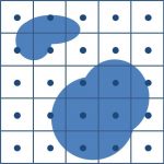
Spatial sampling can be spaced contiguously or randomly on the landscape, and each sampling design has advantages and disadvantages.
Spatially Contiguous Sampling
In spatially contiguous sampling, sampling units are arranged in a transect or lattice. The extent is exhaustively sampled and the resulting data represent the entire population of sampling units within the extent. This sampling design allows a finer description of the spatial pattern, because there are no information gaps, and therefore no information, are missing
Systematic Sampling

In other sampling strategies, such as the systematic sampling strategy shown here, the spatial sampling units are not spatially contiguous. Therefore, the extent is not completely surveyed and information is missing about the spatial pattern.
The spatial lag (distance) between the sampling units is directly related to sample size, extent, and grain:
- Given a fixed extent and grain, as the sample size increases, the spatial lag decreases.
- Given a fixed sample size and grain, as the extent increases, the spatial lag increases.
- Given a fixed extent and sample size, as the sample unit size (grain) gets smaller, the spatial lag decreases.
Choosing a lag distance
The choice of spatial lag between sampling units should be guided by the goal of the study:
- If the goal is to detect, characterize, and quantify spatial pattern and obtain insights about ecological processes, then the aim of the spatial analysis will be to test for spatial dependence and spatial autocorrelation. To detect the spatial pattern, the lag between sampling units needs to be smaller than the size of the patch or process (e.g. spatial structure or species dispersal ability). There should be several samples within each patch.
- If the goal is to establish the relationship between two or more kinds of ecological data, spatial analysis can detect spatial cross-correlation. Once the effects of spatial dependencies and correlation are accounted for, inferential tests that require independent sampling can be applied..
When the spatial lag is smaller than the spatial pattern of the data, the spatial pattern detected can better describe the patchiness and periodicity of the data.
When the spatial scale of the process is unknown, sampling designs with several spatial lag distances are preferred, so that the spatial pattern can be identified.
Location on the landscape and edge effect
Location of the study area in the landscape can affect, or even bias the results of spatial analysis. The position of the study area relative to the spatial pattern will affect the estimation and description of the pattern itself.
Additionally, sampling units along the edge of the study area border have fewer neighbors, resulting in distortions of spatial patterns detected, especially at small distances. There are several rules of thumb for minimizing edge effects:
- During sampling, a buffer zone can be used around the study area.
- If a buffer is not available, calculation of spatial statistics can be limited to the interior of the extent, using sampling units at the border only when examining spatial patterns at small distances.
-
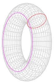
Torus, image from Wikipedia, accessed 12/16 Another technique is using ‘torus distances,’ where opposite borders are wrapped and joined-the north to the south and the east to the west-to create a donut shaped structure called a torus. In this way, samples at the northern border are used as neighbors for samples at the southern border, for example. The torus correction relies on the assumption that the extent is a homogenous area and that the process of interest is stationary.
Topic 2. Spatial Statistics
Why Spatial Statistics?
Spatial statistics were developed specifically for use with geographic data. Unlike traditional non-spatial statistical methods, they incorporate space and locations of features directly into their mathematics. As such, spatial statistics provide the ability to:
- quantify and test patterns in spatial data
- identify non-random patterns (e.g. clusters)
- interpolate or extrapolate point data to infer spatial distributions of a variable
- identify spatial scales over which patterns (or processes) remain constant
In this topic, we dive into some of the most commonly used spatial statistics for conservation-related questions. We provide the basic math behind each statistic so that you can better understand and interpret results. In Topic 3, we show how to use these stats in ArcGIS and what the results will look like. You will try some out yourself in the lab!
Spatial dependence
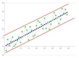 Spatially dependent data contain information about the relationship between values at nearby locations. The applicability of spatial statistics demands that the data be spatially dependent. As the dependence increases, the uncertainty of predictions about additional locations decreases.
If the data are spatially independent, there is no way to predict a data value at an unsampled location based on location alone.
In the graph above, we can see that it would not be difficult to predict the value of one or several blue points (highly spatially dependent) if they were removed, but the prediction of a green point (moderately spatially dependent) could only be placed within the area bounded by the red lines.
Spatial autocorrelation
Most spatial ecological data follow what is known as the first law of geography: “Everything is related to everything else, but near things are more related than distant things” (Tobler 1970).
Spatial autocorrelation is a measure of the spatial dependence in the data. In general, it is estimated by comparing the value at one location with those values at given distances away. Spatial autocorrelation is positive when the values of the data tend to be clustered together in space; it is negative when the values in the data are spatially dispersed.
Getting to Know the Data
The first step in understanding spatial data is exploratory spatial data analysis (ESDA).
ESDA allows you to explore and visualize data in more quantitative ways than mapping alone and provides a sense of the phenomena you are investigating. Some examples of ESDA tasks and tools are illustrated below.
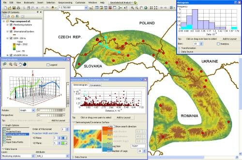
ESDA Tasks
The most common tasks in ESDA are:
- Examining the distribution of the data using scatter plots
- Looking for global and local outliers
- Looking for global trends
- Examining local variation
- Examining spatial autocorrelation
We will explore these tasks further in the next pages.
Point Pattern Analysis
Calculating spatial statistics quantifies the patterns and makes it easier to compare patterns for different distributions or different time periods and helps answer questions such as, “Are the features in the dataset, or the values associated with the features in the dataset, spatially clustered?”
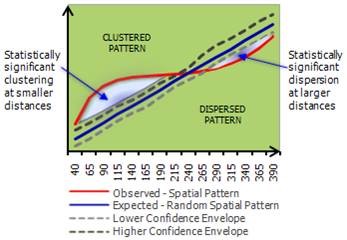
In point pattern analysis x,y points are treated as attributes. Example point pattern analyses include:
- Ripley’s K
- Nearest neighbor
In the Ripley’s K output shown on the right, where the x-axis represents distance, pairs of points at shorter distances are more clustered than expected at random (above the confidence envelope), while those at longer distances are more dispersed than expected.
Spatial Autocorrelation
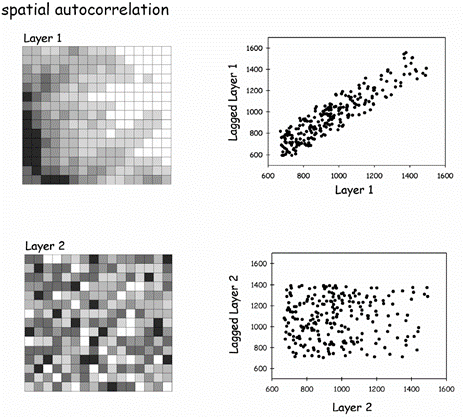
A single variable is said to be spatially auto-correlated if a significant association, measured by the correlation coefficient, can be detected between points as a function of their spatial location.
Spatial autocorrelation is used to determine if clustering is a global property of the spatial pattern in a dataset and if the values of a variable at specific locations are closer together than at other locations.
In contrast to point pattern analysis, spatial autocorrelation looks for how clustered or dispersed the attribute VALUES of a spatial data set are, not just its point locations.
Spatial autocorrelation can be calculated using Moran’s Index (Moran’s I) or Geary’s ratio (also called Geary’s C).
Moran’s I:

where N is the number of spatial units indexed by i and j; X is the variable of interest; X bar is the mean of X; and wij is an element of a matrix of spatial weights.
The value of Moran’s I ranges from -1, indicating perfect dispersion/no correlation, to +1, indicating perfect correlation. Negative values indicate negative spatial autocorrelation or a regular pattern and positive values indicate a clustered pattern. A near-zero value indicates a random spatial pattern. For statistical hypothesis testing, the null hypothesis is that the features exhibit a spatially random pattern. Moran’s I values can be transformed to Z-scores in which values greater than 1.96 or smaller than −1.96 indicate spatial autocorrelation that is significant at the 5% level.
Geary’s ratio:
![]()
where N is the number of spatial units indexed by i and j; X is the variable of interest; X bar is the mean of X; wij is a matrix of spatial weights; and W is the sum of all wij.
The value of Geary’s C ranges from 0 to 2, where 1 indicates no spatial autocorrelation or a spatially-random pattern, values close to 1 indicate increasing positive spatial autocorrelation, and values >1 indicate increasing negative spatial autocorrelation.
Both combine the two measures for attribute similarity and location proximity into a single index.
Visualizing spatial autocorrelation
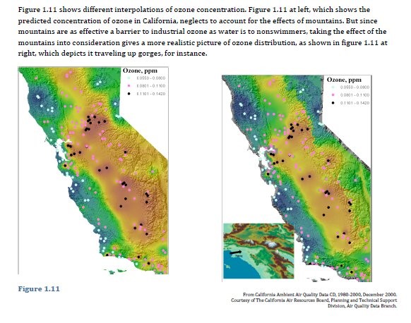
A correlogram provides a visualization of the change in spatial relationships by plotting the autocorrelation values on the x-axis and the lagged distance or distance between points, h, on the y-axis. Correlograms are often analyzed by examining their shape, since characteristic shapes are associated with different spatial structures.
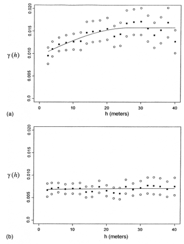
Often it is tricky to infer the spatial distribution of variables from a small sample of point measurements. Luckily, geostatistical techniques have been developed to provide estimates of the spatial distributions from limited sets of point data, using semivariograms and kriging.
Semivariograms – define the spatial scales over which data are dependent. Semivariance is calculated by:
![]()
where the data is arranged in N pairs (xi and xi+h) separated by distance h, with N(h) equal to the number of pairs. The summation is made over all possible pairs and lagged distances, h.
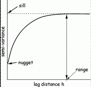 The semivariogram (shown at the right) is created by plotting the semivariance on the y axis and the lag distance h on the x axis. We use the following structures to characterize semivariograms:
Sill – the curve levels off at distance h, implying that there is no spatial dependence in the data after this point (variance is now independent of distance between points).
Nugget – the non-zero intercept, portion of the variance not explained by spatial structure (variation). It is a measure of the sampling and measurement error.
Range – the distance (h) on the x axis to the sill (the asymptotic value), the spatial extent over which spatial dependencies can be detected. Within the range, the closer the points, the more similar they are likely to be.
The semivariogram is the inverse image of the spatial correlogram and is also interpreted visually, with a relatively flat variogram indicative of a pattern without spatial structure. The range and sill of a semivariogram can tell you at what distance the variation levels off, and therefore, that distance doesn’t matter anymore to the variable of interest.
Spatial Estimation
Surface interpolation tools create a continuous (or prediction) surface from sampled point values. Visiting every location in a study area to measure the height, concentration, or magnitude of a phenomenon is usually difficult or expensive. Instead, you can measure the phenomenon at strategically dispersed sample locations, and predicted values can be estimated for all other locations. Input points can be either randomly or regularly spaced or based on a sampling scheme. There are several tools for interpolation.
A raster surface can be interpolated from points using an inverse distance weighted (IDW) technique. Inverse distance weighted (IDW) interpolation determines cell values using a linearly weighted combination of a set of sample points. The weight is a function of inverse distance. The surface being interpolated should be that of a location-dependent variable.
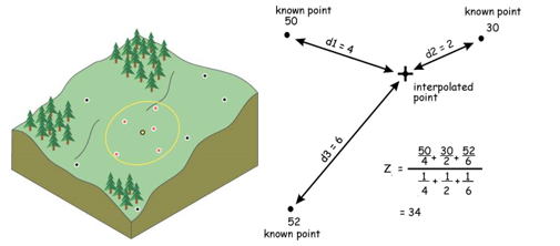
Kriging is similar to IDW in that it weights the surrounding measured values to derive a prediction for an unmeasured location. The general formula for both interpolators is formed as a weighted sum of the data:
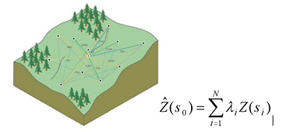
where Z(si ) is the measured value at the ith location
λi is an unknown weight for the measured value at the ith location
s0 is the prediction location
N is the number of measured values
Kriging uses semivariograms to predict the expected value of a variable at some location by using the weighted average of the expected values based on distance from the other points. The weights account for correlation in the data. In IDW, the weight, λi, depends solely on the distance to the prediction location. (See pdf reading on interpolation).
Tools for Spatial Statistics in ArcGIS
Spatial Statistics Tools in ArcGIS
There are several tools in ArcGIS for calculating spatial statistics. Here, we will explore some of these tools.
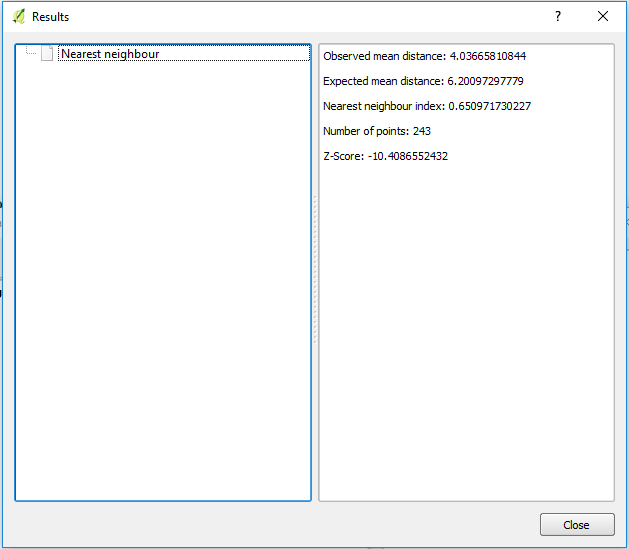
The Average Nearest Neighbor tool calculates a nearest neighbor index based on the average distance from each feature to its nearest neighboring feature compared to the average distance for a random distribution. The tool returns five values:
- Observed Mean Distance – average distance between the feature and its nearest neighbor
- Expected Mean Distance – the average distance between neighbors in a hypothetical random distribution
- Nearest Neighbor Index – expressed as the ratio of the Observed Mean Distance to the Expected Mean Distance. If the index is less than 1, the pattern exhibits clustering; if the index is greater than 1, the trend is toward dispersion or competition. If the index is near 1, there is no evidence against a random distribution.
- and 5. Z-score and p-value – measures of statistical significance which tell you whether or not there is evidence to reject the null hypothesis. For the Average Nearest Neighbor statistic, the null hypothesis states that features are randomly distributed.

QGIS has similar capabilities with the Nearest Neighbor Analysis vector analysis tool.
The Moran’s I tool measures spatial autocorrelation based on feature locations and attribute values. Moran’s I doesn’t identify clusters on the map, but rather identifies whether the pattern of values across the study area tends to be clustered, random, or dispersed. The tool returns five values:
- Moran’s I Index – a positive Moran’s I index value indicates tendency toward clustering while a negative Moran’s I index value indicates tendency toward dispersion
- Expected Index
- Variance
- and 5. Z-score and p-value – indicate the strength of evidence against the null hypothesis. In this case, the null hypothesis states that feature values are randomly distributed across the study area

Mapping Clusters
Given a feature class with values, the Hot Spot Analysis tool uses the Getis-Ord Gi* statistic to identify statistically significant spatial clusters of high values (hot spots) and low values (cold spots). It creates a new Output Feature Class with a z-score and p-value for each feature in the Input Feature Class.
The z-scores and p-values are measures of statistical significance that tell you whether or not to reject the null hypothesis, feature by feature. In effect, they indicate whether the observed spatial clustering of high or low values is more pronounced than one would expect in a random distribution of those same values.
Areas where high values cluster are called hot spots, and areas where low values cluster are called cold spots.

Neighborhoods
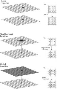
Neighborhood tools create output values for each cell location based on the location value and the values identified in a specified neighborhood. The neighborhood can be of two types: moving or search radius.
Neighborhood interpolation is particularly common in raster analysis. As we have seen previously, raster operations may be local, neighborhood, or global as illustrated to the right.
Common applications are calculating slope, aspect, and regional temperature.
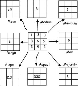
When using neighborhoods for interpolation, the moving window approach calculates the value of each cell based on the values of neighboring cells within a specified neighborhood or window around it. In the example below, a 3×3 window is swept from left to right and top to bottom. The window at each location defines the input cells used in a raster operation, such as mean, min., max, slope, etc.
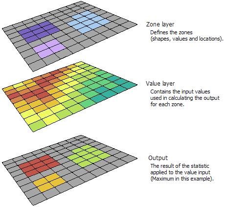
With the zonal statistics tool, a statistic is calculated for each zone defined by a zone dataset, based on values from another dataset (a value raster). A single output value is computed for every zone in the input zone dataset. A zone is defined as all areas in the input that have the same value. The areas do not have to be contiguous. Both raster and feature datasets can be used for the zone input.
In the example below, the zone layer is the input raster that defines the zones. The value layer contains the input for which a statistic is to be calculated per zone. In this example, the maximum of the value input is to be identified for each zone.
QGIS has a zonal statistics tool in the raster analysis toolbox with similar functionality as ArcGIS.
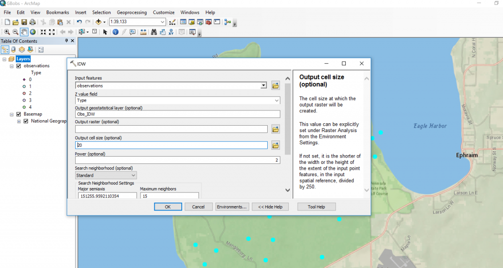
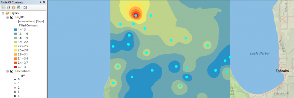
Finally, with ArcGIS’s Geostatistical Toolbox we can run interpolation tools such as IDW to generate a smooth surface from a set of sample points:
