
Main Body
4 Lesson 4
Welcome to Lesson 4—Accessing Public Environmental Data through Partnerships and Mapping Green Infrastructure
In this lesson, you will:
- Integrate public environmental spatial data available through partnerships
- Learn to use spatial optimization strategies and performance dashboards to evaluate options
- Apply public environmental data to map green infrastructure
- Review methods to make good maps
Lesson 4 Topics
This lesson covers three topics. We recommend working through each topic in the order in which they are listed below.
1. Public environmental spatial data and partnerships
Emerging geographic information system themes and directions
Since its inception, geographic information system (GIS) data and tools have developed at a rapid pace. According to Kerski and Clark (2012, Chapter 10), the future of GIS will develop along at least four fronts:
- New spatial data
- New partnerships
- New methods and tools
- New platforms
In this topic, we focus on new environmental spatial data and partnerships. Topics 2 and 3 address the other two fronts: new methods, tools, and platforms.
As you’ve seen, environmental spatial data are available in the public domain—from established mapping and land management organizations as well as organizations that have not previously been the providers of geographic data.
For example, The Nature Conservancy (TNC) provides map services via TNCMaps, an online data portal for vector data related to its conservation initiatives and land holdings that can be accessed as shapefiles or geodatabase formats using standard GIS platforms.
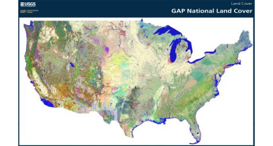
State and federal governments also release data, such as the seamless national land cover vegetation raster dataset that represents the culmination of the Gap Analysis Program (GAP) and was made available through a collaborative effort between the United States Geological Survey (USGS) and the University of Idaho. GAP collects and distributes data to answer the fundamental question, “How well are we protecting common plants and animals?” by identifying those species and plant communities that are not adequately represented in existing conservation lands. To do so, a Gap analysis identifies species’ habitat and distribution, protected lands in relation to those species, and where there is a “gap” in protection for species. GAP raster and vector data are used widely across the United States for conservation planning. You will have a chance to work with GAP later.
The LANDFIRE project represents another collaborative effort between government agencies (US Forest Service and US Department of the Interior) and nonprofits (TNC) to produce over 20 national geospatial data layers in raster, vector, and tabular formats, including vegetation, fuel, and disturbances among many others. LandFire is not just for fire! While early on it was a response to large wildland fires and their mitigation and impact, LandFire is used more broadly now for a variety of land change assessments.
Meanwhile, high-resolution imagery and three-dimensional (3D) data are more widely available and accessible to environmental applications through public domain sources. Perhaps the fastest growing demand from environmental applications is for Light Detection and Ranging (LIDAR) data.
LIDAR is a remote sensing method that uses pulses of light energy to generate 3D data of the structure of the earth’s surface. The data can be collected from a variety of platforms, including satellites, airplanes, and ground-based devices.
Many agencies are collecting LIDAR to generate data for different applications, including national elevation models for sea-level rise impact studies, data on the structure of vegetation in natural areas to estimate ecosystem productivity and habitat quality, and urban infrastructure for storm water management and flooding scenarios. Here is a link to free lidar data sources: http://gisgeography.com/top-6-free-lidar-data-sources/
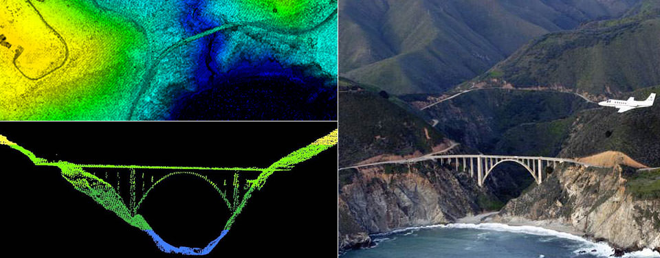
LIDAR data are often collected by air, such as with this NOAA survey aircraft (right) over Bixby Bridge in Big Sur, Calif. Here, LIDAR data reveal a top-down (top left) and profile view of Bixby Bridge. NOAA scientists use LIDAR-generated products to examine both natural and man-made environments. LIDAR data support activities such as inundation and storm surge modeling, hydrodynamic modeling, shoreline mapping, emergency response, hydrographic surveying, and coastal vulnerability analysis. (https://oceanservice.noaa.gov/facts/lidar.html).
In many cases, LIDAR or other high-resolution imagery is acquired independently for specific applications, where the sensor is contracted to be flown over a certain area and time. However, LIDAR datasets for many coastal areas can be downloaded from the Office for Coastal Management Digital Coast web portal.
As GAP, LANDFIRE, and LIDAR data illustrate, partnerships have forged that enable increased access to and sharing of geospatial data by the general public.
In turn, tools for accessing this data have become more user-friendly as a result of government–private partnerships, which led to the development of Data.gov, for example, collaboration between ESRI and government agencies.
Even as access to data and online visualization tools are readily available, more and more tools continue to enable analysis of environmental spatial data via the web.
Cloud Computing
Cloud computing enables remote, network access to a shared pool of resources. The cloud consists of networks, servers, data storage, applications, and services. In GIS, cloud computing enables users to access data and run software remotely, access services and clients, and host content.
Cloud-based mapping programs like ArcGIS.com facilitate access to publicly available spatial data and mapping, especially for those without access to or training in desktop GIS.
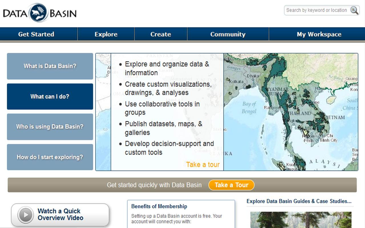
DataBasin
Likewise, several organizations have online data portals with the added functionality of data sharing, discussion boards, and groups that enable data portals to become intellectual communities. DataBasin, hosted by the Conservation Biology Institute, is an example of such an online community that you learned about earlier.
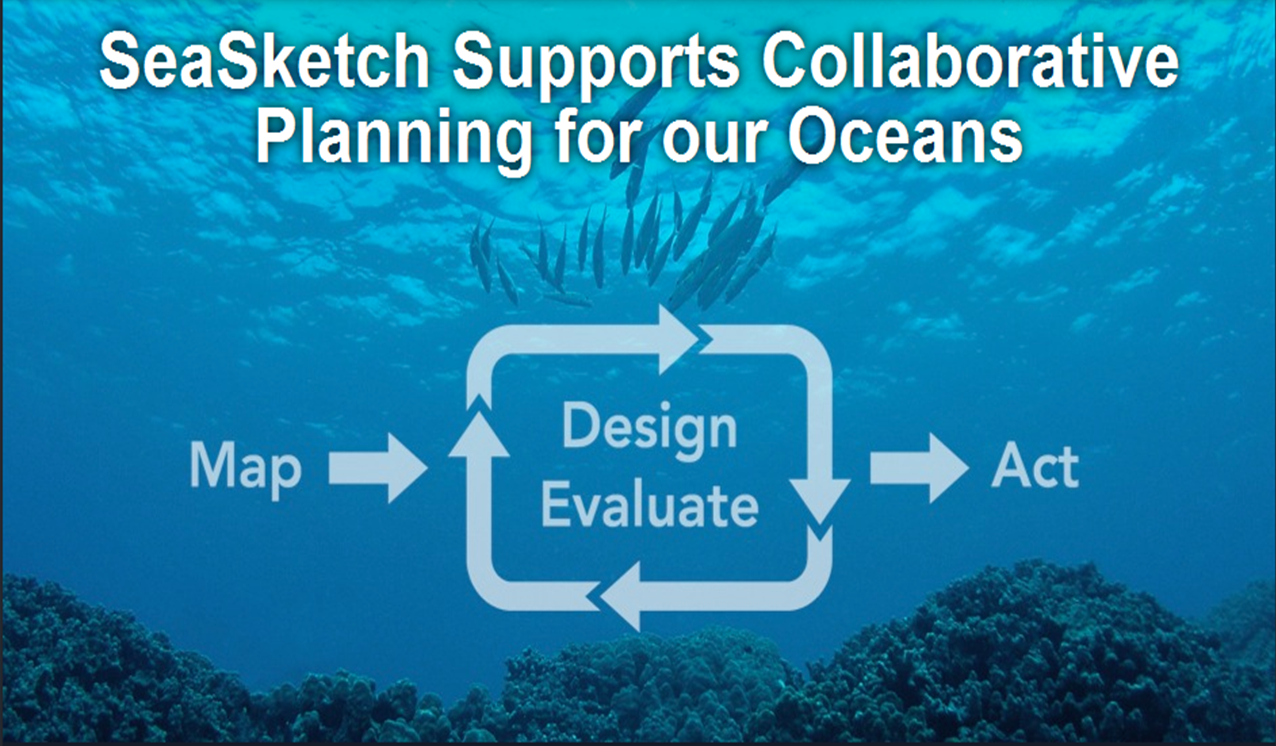
SeaSketch
Similarly, SeaSketch is an online tool developed by the McClintock Lab in the Marine Science Institute at the University of California Santa Barbara to enable collaborative planning for ocean conservation.
SeaSketch allows users to generate information—they can produce and share sketches, edit and share views of maps, discuss their ideas, and post sketches to larger discussion forums. This allows users to participate in marine spatial planning without the need for GIS training or software.
NatureServe
NatureServe represents another kind environmental partnership—a network of over 80 programs (e.g., state natural heritage) and scientists serving spatial data and solutions for biodiversity protection. NatureServe has a page of data, maps, and tools to support a variety of land management assessments and stewardship.

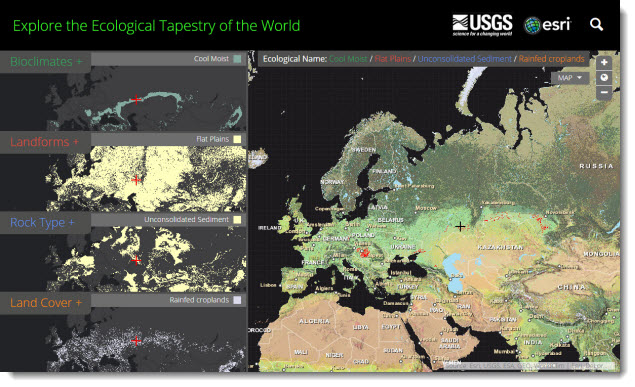
Ecological Land Units Map and Data Sets of World
Another great example of new spatial data and new partnerships in a cloud computing environment is the Ecological Land Units Map and Data Sets of World. This Esri Insider post and storymap describe the Global Ecological Land Units for an analysis.
Finally, we conclude this topic with Kerski’s top 10 list of useful geospatial data portals (from January 2017)
https://spatialreserves.wordpress.com/2017/01/29/a-top-10-list-of-useful-geospatial-data-portals/
Topic 1 Knowledge Check
Please answer the following questions to proceed to the next topic.
2. Spatial Optimization Strategies: Suitability and Vulnerability Analyses with Overlay
Last week you learned how to ask spatial questions, select the appropriate geoprocessing steps, and string them together with ModelBuilder. Here we build on those skills with more complex spatial design and decision-based questions.
Spatial Optimization Strategies
Suitability and vulnerability analyses are sometimes referred to as spatial optimization strategies because both attempt to optimize the best (or worst) locations for a given land use.
Suitability
With suitability, we might be optimizing siting for a new housing development or habitat for wolves.
Suitability analyses tend to be:
- Offensive, or proactive
- Development oriented
- Ask “What places are best for . . .”
- Location optimal
Finding the best route to connect two segments of the Ice Age Trail is an example of a suitability optimization.
Vulnerability
With vulnerability, we often seek to find areas that are most at-risk from a proposed land use.
Vulnerability analyses tend to be:
- Defensive
- Conservation or protection oriented
- Ask “What places are worst for or will be most impacted by . . . ?” or “Where are the greatest risks?”
- Location sensitive
Identifying the areas potentially impacted by proposed Penokee–Gogebic mine in Northern Wisconsin is an example of an optimization strategy aimed at vulnerability assessment.
Overlay Analysis
GIS is often used to tackle one of the most foundational spatial optimization questions: What’s on top of what, or where do features overlap on the ground? Overlay tools simply combine different layers of spatial data, building on Boolean logic you learned earlier.
The Overlay toolset contains tools to overlay multiple feature classes to combine spatial features through map algebra, resulting in a new feature class. New information is created when overlaying one set of features with another.
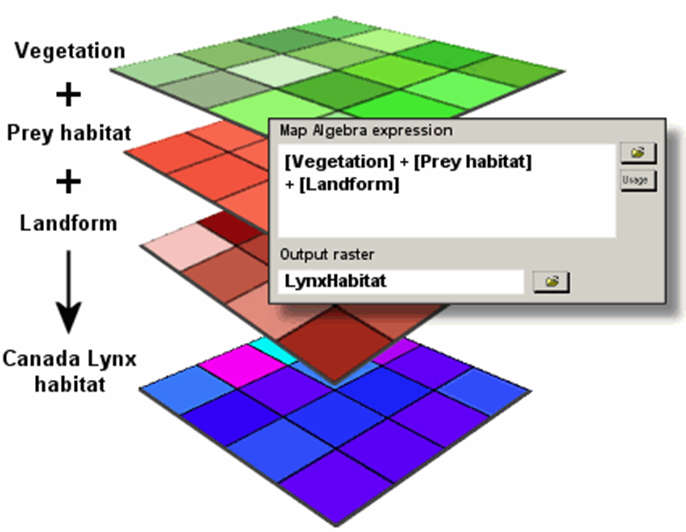
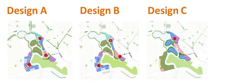
This example shows how vegetation, prey habitat, and landform can be combined by raster addition. The resulting composite map or overlay identifies areas that are most likely to provide Canada Lynx habitat.
When you wish to overlay the layers with differing amounts of influence, they can be weighted based on their importance to produce a weighted overlay in GIS. You saw a sample of weighted overlay in our geoprocessing topic. A weighted overlay tool is a specialized overlay analysis to solve multicriteria problems with variable weights, such as site selection suitability and vulnerability analyses.
Geoprocessing for Overlay Analysis
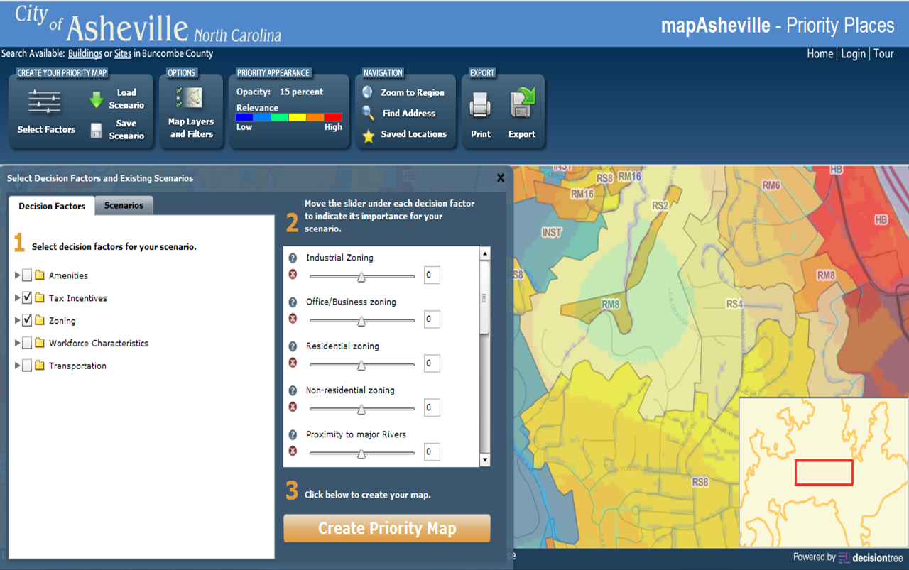
Behind the scenes of any complex overlay analysis is some kind of geoprocessing sequence. The geoprocessing model below was built for the City of Asheville, North Carolina, to identify “priority places” for new business development. The model included a series of input layers like roads, parks, and business centers that could be selected by attributes or location, and each could be weighted differently.
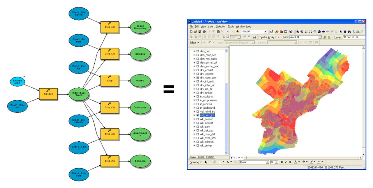
The Priority Places tool used weighted overlay to choose the location of a new business in the City of Asheville.
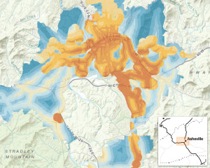
Citizens and decision-makers of Asheville, however, did not see the weighted overlay model running in the background. Instead, they interfaced with an interactive user dashboard where they selected the input layers, criteria (e.g., distance from), and weights to identify their priority places.
Automating Geoprocessing
To run more complex alternative scenarios, there are mechanisms for automating geoprocessing.
For example, in the ArcGIS ModelBuilder application, the following tools are used to automate the process of using different inputs or criteria and generating a variety of outputs:
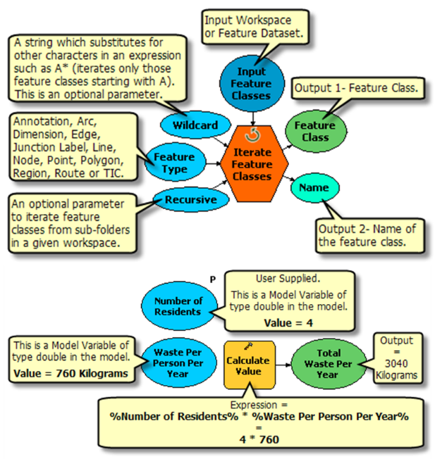
- In-line variable substitution
- Lists
- Iteration
- Feedback
Learning to use these functions is beyond the scope of this book. However, if you are interested in learning more on your own, visit Advanced Techniques in ModelBuilder.
ModelBuilder provides a graphical interface for generating a model that can automatically run a geoprocessing sequence with different inputs and criteria. On the back end, the computer is running code to execute the model you created visually. For example, many GIS programs use the programming language, Python. In some cases, it may be more efficient or allow more flexibility to script a model by writing lines of Python code than by building a graphical model. ArcGIS and QGIS allow users to view and edit the Python code generated by their model building tools, though it’s always good to start any model or scripting by drawing out what you want to do first!
Performing Sensitivity Analysis
Sensitivity analysis is used to explore how the output of spatial optimization strategies—suitability and vulnerability analysis—change with slight variations in the input criteria parameters.
For example, in a housing suitability model to identify the most desired locations to add building lots based on specified criteria—slope, aspect, distance to river—sensitivity analysis could be performed by changing each of the input criteria by small increments and measuring the resulting changes in output. For example, does a 50-m increase in distance from the river dramatically decrease the area suitable for housing?
A model, whether built graphically with model building tools or through scripting in a programming language, enables users to quickly perform sensitivity analyses by changing these parameters in a suitability or vulnerability model. Using lists, series, or reclassification tables can facilitate iterations of models for efficiently running sensitivity analyses.
Topic 2 Knowledge Check
Please answer the following questions to proceed to the next topic.
3. Applying Environmental Spatial Data and Partnerships to Map and Assess Green Infrastructure
Next we apply public environmental spatial data and partnerships to spatial optimization applications with green infrastructure.
Grey Infrastructure
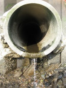
Think of all the hard facilities and structures that connect and run the machine of our built environment (roads, storm drains, sewers, culverts, etc.). We call that necessary network “grey infrastructure.”

Green Infrastructure
Equally important is the network of streams, wetlands, greenways, green roofs, and natural corridors, called “green infrastructure,” for absorbing rainwater, filtering storm water, holding slopes from erosion, reducing urban heat, and connecting habitats. Worldwide, the need to identify, design, and maintain green infrastructure networks takes a priority seat next to grey infrastructure for communities and regional planners. To facilitate planning for green infrastructure, especially across boundaries, partnerships like the World Green Infrastructure Network and Green Infrastructure Collaborative of US agencies take the helm.

Since 2014, the US EPA (Environmental Protection Agency) coalesced other federal agencies, nongovernmental organizations, and private sector entities into the Green Infrastructure Collaborative, “a network-based learning alliance created to help communities more easily implement green infrastructure.”
Depending on their focus, different organizations, networks or agencies emphasize and define green infrastructure differently. For instance, the EPA’s focus for green infrastructure is primarily on storm water. Their definition reads:
Green infrastructure is a cost-effective, resilient approach to managing wet weather impacts that provides many community benefits. While single-purpose gray storm water infrastructure—conventional piped drainage and water treatment systems—is designed to move urban storm water away from the built environment, green infrastructure reduces and treats storm water at its source while delivering environmental, social, and economic benefits.

Alternatively, the World Green Infrastructure Network (WGIN) focuses on growing the network of green roofs and walls:
The World Green roof Infrastructure Network collects and disseminates knowledge, information and data concerning roof and wall greening, worldwide.

Others approach green infrastructure from protected areas management and conservation. Identifying our most valuable places to protect for future generations begins with spatial optimization—essentially broad-scale suitability and vulnerability analyses. Here, green infrastructure is applied as a spatial concept to understand the best places for growth and choose development that has smaller footprints, protects key habitats, and makes landscapes more connected and resilient. In this case, natural resources are seen as part of connected infrastructure that supports our everyday lives.
This view drove Esri founder and president to launch a Green Infrastructure Initiative, “to assemble, evaluate, and produce a model to enable governments to protect and restore biodiversity while guiding economic development decisions.”
—Jack Dangermond, Esri.com/greeninfrastructure
Esri’s initiative defines green infrastructure as:
“. . . a strategically planned and managed network of open space, watersheds, wildlife habitats, parks, and other natural and seminatural areas that enrich and sustain communities.”
The green infrastructure initiative provides a system or model, along with tools and spatial data to map green infrastructure. The model is built around several key components to be mapped and overlaid:
- Ecological resources
- Cultural, historic, and scenic resources (including parks and recreation)
- Hazard areas that pose environmental risks or costs
- Connections, or networks of ecological corridors
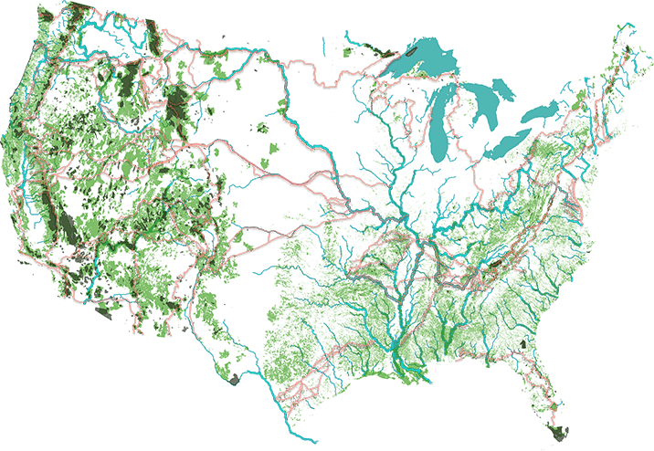
At its simplest level, site visitors can enter an address to ask how green their county/town or region is and how green it is likely to be in the future. The web-based green infrastructure mapping tool overlays best available spatial data to determine the amount of intact core habitat and green infrastructure for the selected location relative to the national average.
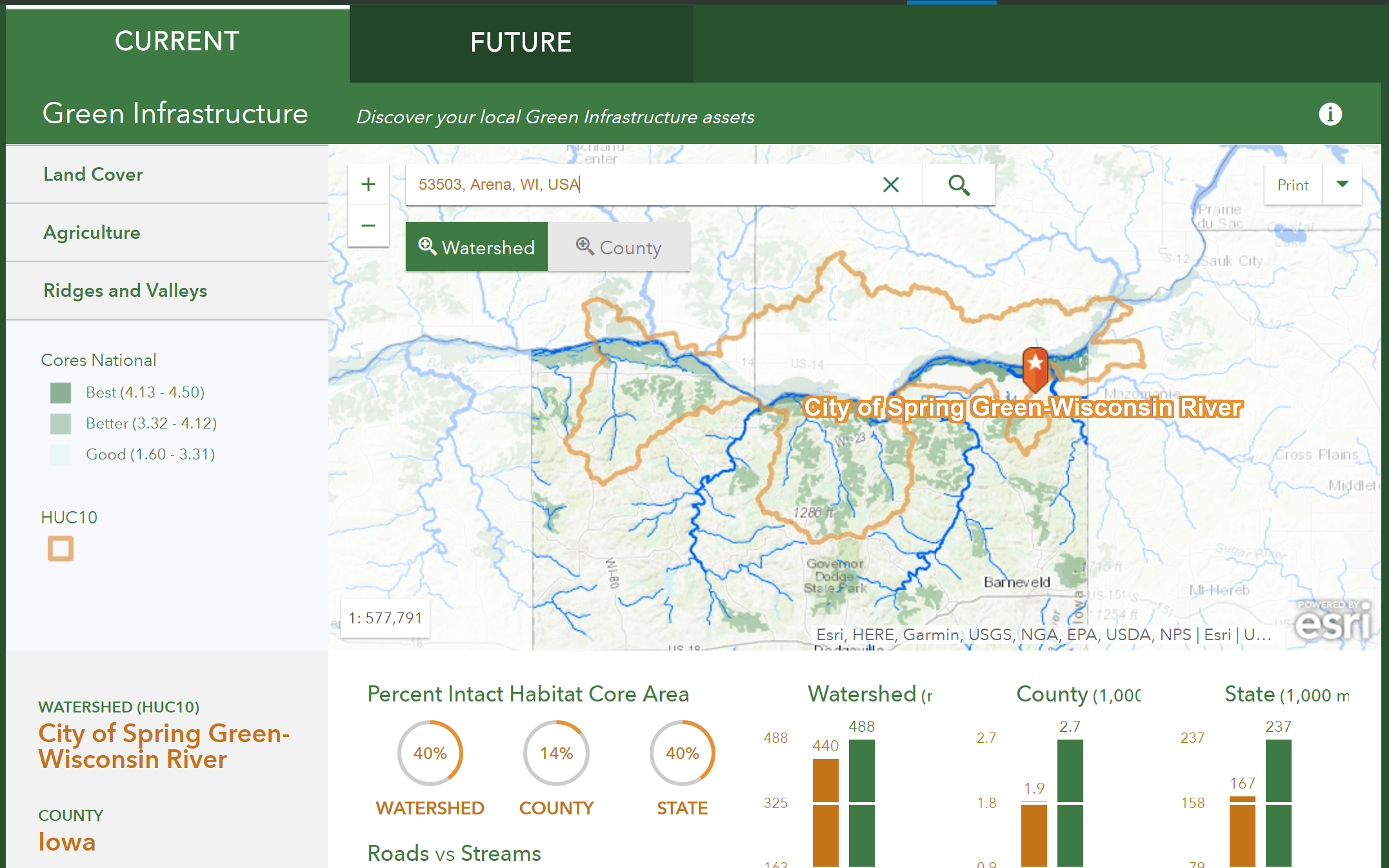
There are also a series of advanced apps for green infrastructure analysis and a downloadable ArcToolbox. The apps allow users to select and prioritize landscape cores, rank landscape cores with different weighting scenarios, and conduct a landscape analysis to identify areas with characteristics your community wants to protect. While you might not see it, behind the scenes, the Esri Green Infrastructure apps incorporate many of the tools and data covered in the last few lessons, including:
- Public environmental spatial data
- Geoprocessing models for spatial optimization (suitability and vulnerability assessments)
- Weighted overlay within geoprocessing models
- Dashboards
- Scenario management
- Collaboration and partnerships
For instance, behind the Core Weighting app for green infrastructure, a weighted overlay runs every time the user changes the slider value for any of the spatial data layers in the map. After the weighted overlay is run with new parameters, an updated view of best and better core habitat is displayed.
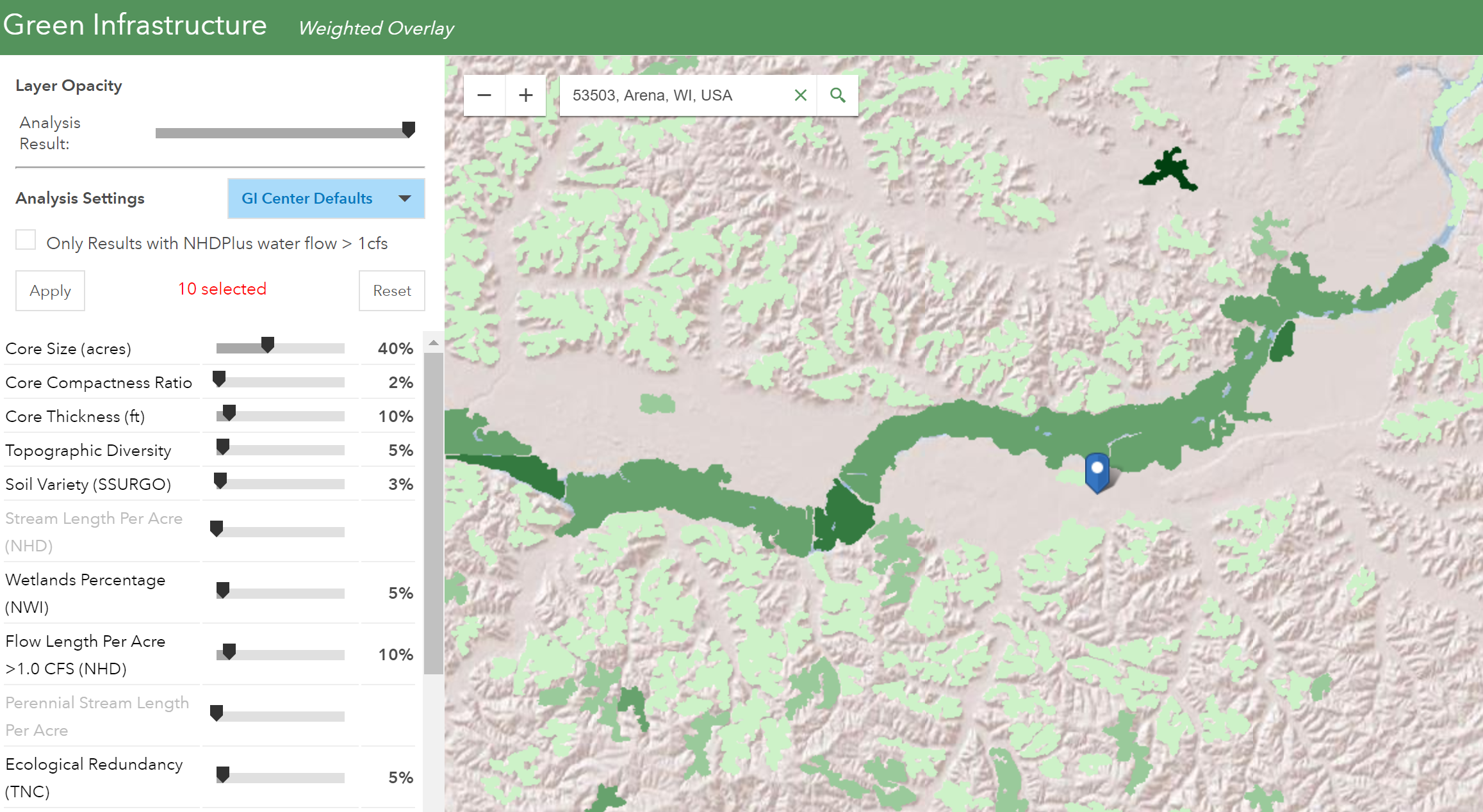
Here the user interfaces with a dashboard rather than the geoprocessing model.
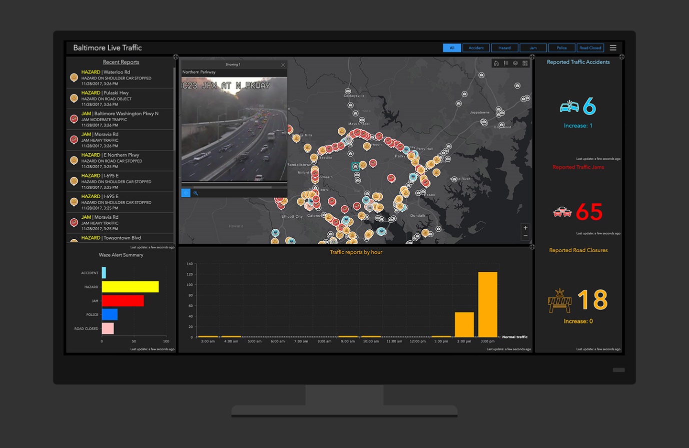
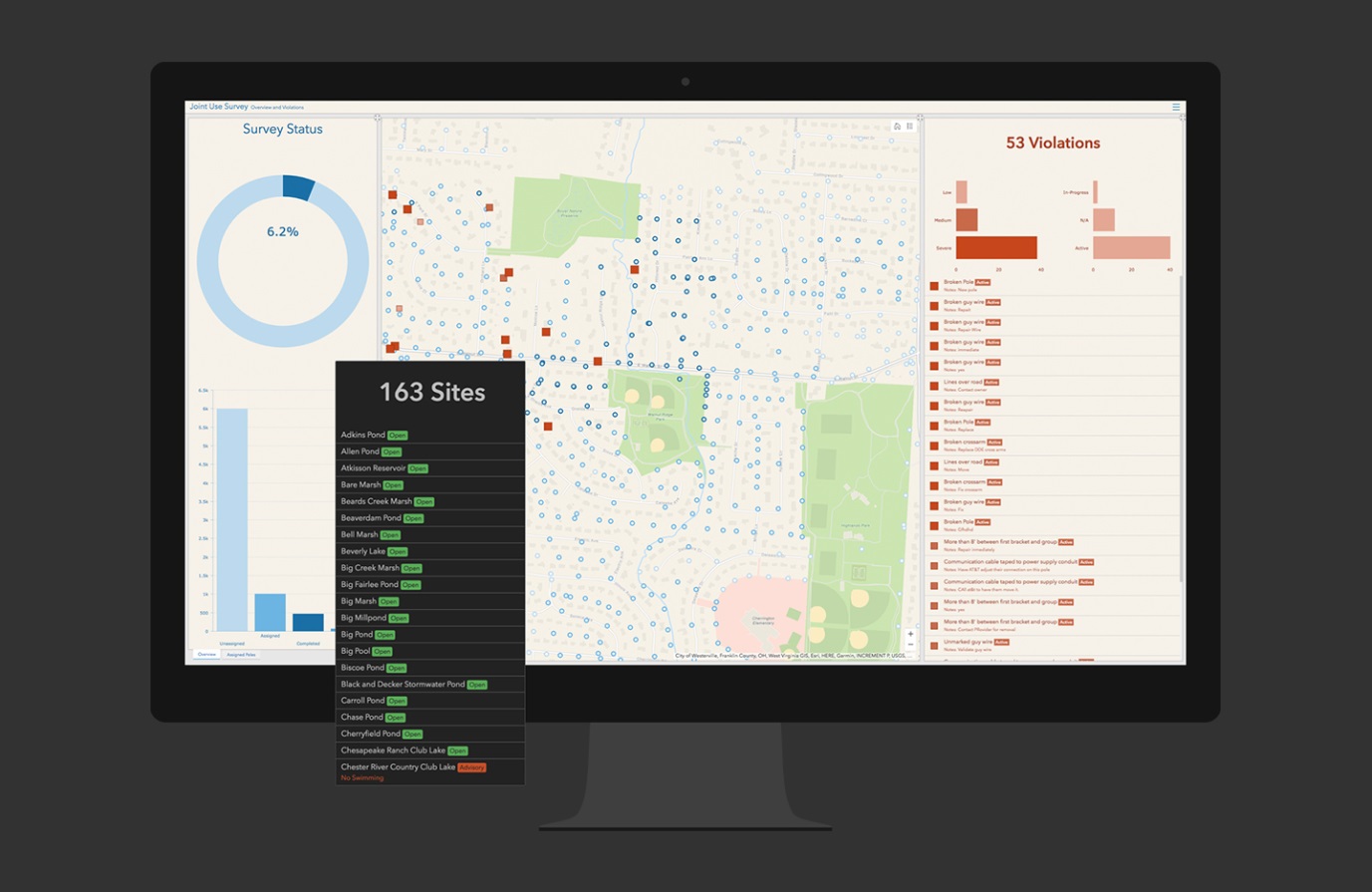
Dashboards
Dashboards, also called feedback displays, indicate performance metrics of a given alternative spatial designs, such as how many biodiversity cores are in a county or length of a riparian buffer, for example, much like a car dashboard tells how fast you’re going and how much fuel is left. When you make changes to the spatial criteria, new performance metrics are displayed.
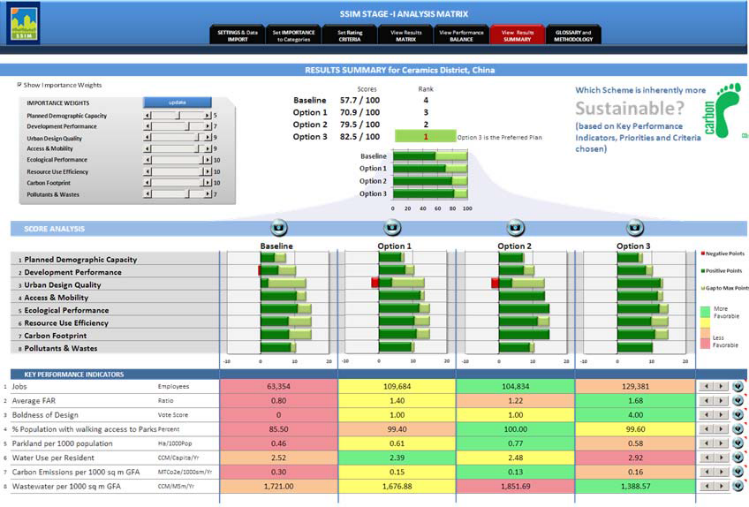
For example, like Priority Places, the Sustainable Systems Integration Model (SSIM) of Asia Development Bank uses performance dashboards, shown here, to compare alternative design plans against a number of sustainability metrics.
Dashboards are tools to manipulate spatial analyses in an interactive environment with immediate feedback for evaluation. They are especially useful for decision-makers who have little experience with GIS.
Newer and more broadly accessible, the Operations Dashboard for ArcGIS helps users create performance dashboards. As a configurable web app, you can add analytics, metrics, and visualization tools to your web maps through ArcGIS online. The maps and indicators update in real time and can be shared with stakeholders to support collaborative and actionable decision-making.
To read more about this dashboard:
https://www.gis-professional.com/content/news/esri-releases-operations-dashboard-for-arcgis
https://www.esri.com/en-us/arcgis/products/operations-dashboard/overview
Scenario Management
Finally, scenario management can be essential for large green infrastructure or other spatial optimization projects. When examining many alternative options, changing parameters slightly here and there, the number of scenarios multiplies quickly, and it is easy to lose track of which was which. Scenario management tools keep track and help organize scenario outputs.
Putting it all together with ArcGIS Pro
If there could be a hybrid of desktop GIS and web mapping, it is ArcGIS Pro. Pro works with existing map documents alongside any of the ArcGIS Desktop applications (e.g., ArcMap, ArcCatalog), with all the robust visualization, geoprocessing, and analytical tools. Then, like GIS online, you can share your map projects through the cloud.
The ArcGIS Pro interface will look similar yet different to ArcMap. It was launched in 2015 and is becoming mainstream.
Sharing Maps and Collaborating with ArcGIS Pro
Besides its capabilities for working with two-dimensional (2D) and 3D spatial data, imagery, and visualizations, ArcGIS Pro enables collaborative mapping by directly connecting to online web maps and layers. You can author your map with existing web or public data layers, or with your own data layers. You can then share your web map and layers back out to groups or public for collaboration. Web maps can be opened in ArcGIS Pro as well as in standard web browsers.
Learn more about sharing web maps.
Key Points When Asking and Answering Spatial Questions
As we wrap up Lesson 4 and the Collecting and Mapping Data module, let’s end with some key points to remember when asking and answering spatial questions.
1. Mind the process
Remember that when engaging in the process of geographic inquiry (or spatial thinking) you should always:
- Establish the goals of your project early on
- Focus on the problem or question you wish to solve
- Only work with data that will help you solve that problem
2. Be a critical consumer
Given the trends and QUANTITY of public environmental spatial data, and the ease of sharing map projects, it’s important that you become not just a consumer of spatial data, but a critical consumer who always:
- Examines the metadata and knows where the data came from
- Asks if data is of sufficient quality
- Uses only the most relevant data
References
Kerski, Joseph J., and Jill Clark. 2012. The GIS Guide to Public Domain Data. Redlands, CA: Esri Press.
ArcGIS Pro Helps You Get Work Done Faster. 2014. Esri.com, summer.
Esri Releases Operations Dashboard for ArcGIS. 2018. GIS Professional. https://www.gis-professional.com/content/news/esri-releases-operations-dashboard-for-arcgis.
Topic 3 Knowledge Check
Please answer the following questions to proceed to the next topic.
4. Cartography Best Practices
It is vital that your maps looks good! Why??
Because, a good map can convey a ton of information in a short amount of time and to a very wide audience. But a bad map can confuse and even convey things you never meant to say.
What Makes An OK Map?
All good maps must have:
- A legend
- North Arrow
- Title
- Scale bar
- A brief description of the results, and data sources
But, if I were to make a map that only has the features mentioned above, it would look something like this:
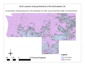
That doesn’t look so great. Let’s break down why.
- the colors aren’t great because I haven’t put any thought into them, I’ve let ArcMap make that decision for me, and ArcMap chooses colors randomly.
- The legend is confusing, the labels have strange names, and if I hadn’t made this map they would make no sense to me (they probably make no sense to you!).
- The title is there, but it could probably be centered better.
- The north arrow is…actually it’s fine.
- The scale bar is using a really strange scale, making it difficult to understand. ArcMap just defaults to whatever units are being used by ArcMap.
- I can’t really tell what the context of this map is. If I wasn’t a US citizen I would have no idea which states these might be.
- What about the Layers I am using? Is it vital that the counties be included? Might there be a simpler, more intuitive layer to use?
So, the point I am trying to make is that every piece of your map should be designed to help highlight what you are trying to tell the reader. So in this case, I want to highlight the BLM grazing allotment in the Northwestern US. So I will attempt to make this pop by putting the study area into context and using some better colors. Then I will ensure my legend is clear and concise, and I will move things around to make the map aesthetically pleasing . Maps are visual, and so we have to ensure we make them look good!
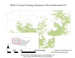
Isn’t that better? Why?
- It’s more simple, the colors are cleaner and make the map clearer
- The map has been put into context, so that it is a but more clear which states are included
- The scale bar is more clear, and in units that make sense
- The legend labels make sense
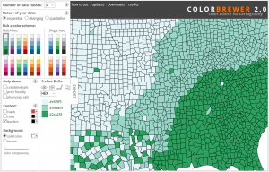
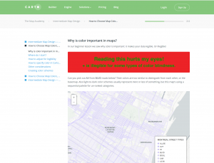
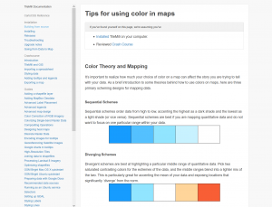
A Note of Colors
Be careful with colors, they can help or hurt you a lot. Make sure you can always tell the difference between colors, and also make sure that you think about your audience. If the map is intended for a very small audience, then the colors can be chosen based more on what you like. But if you are presenting this map to a wider audience, you always have to consider things such as whether or not this map is readable by everyone.
Color Blind Audiences
The most common form of color blindness is red-green color blind, which is most common in men. About 8% of men and 0.4% of women are red-green color blind, which roughly translates to about 1 in 12 men and 1 in 200 women. Therefore, in any given presentation, the chances are relatively high that someone will be colorblind, meaning that as map makers, we should consider this possibility and create our maps accordingly. That isn’t to say that we can never use red or green, but we should be careful about using solely red or solely green scales, and we should always be careful not to use these colors at each end of a scale. Finally, these colors should not be used next to one another. Here are some sources about colors that can used to help find some good color-blind friendly color schemes:
Media Attributions
- Sewer outlet
- 22553777107_f8fda3928b_b
- ACROS Fukuoka
- OkMap
- GoodMap
- ColorBrewer
- Carto
- Tips
