Use Headings To Make Documents Accessible
This page is an adaptation of content in the excellent BCcampus Accessibility Toolkit: 2nd Edition.
Subsections:
Who Are You Doing This For?
When it comes to using visual references to indicate the hierarchy and structure of a document, you may be accustomed to just changing the font, enlarging the type size, or making text bold, underlined, or italicized to the impression of a heading. Yet this approach presents problems when creating material with accessibility in mind because headings are one of the primary ways that students navigate through a document or Canvas page.
Everyone benefits from having content that’s clearly organized. In addition, well-organized and hierarchically-tagged content supports students who:
- Are blind or have low vision, for example, students like Jacob
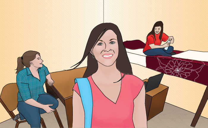
- Have a learning disability, for example, students like Ann

When students who use screen readers encounter a section of text that has simply been bolded or underlined their screen reader won’t identify the text as a heading. Instead, a screen reader will just “read” through the text of a heading as if it were part of another paragraph of content, missing your intended cues about structure and organization.
Because screenreaders use the organizational cues provided by text headings and table structure to help users navigate the page, it’s important to make sure that your document is divided into subsections with properly-tagged headings and subheadings.

Headings also provide a visual cue that helps sighted readers quickly navigate through sections of a document, skimming through content until they find a section they are looking for.
To create effective, accessible headings in Microsoft Word:
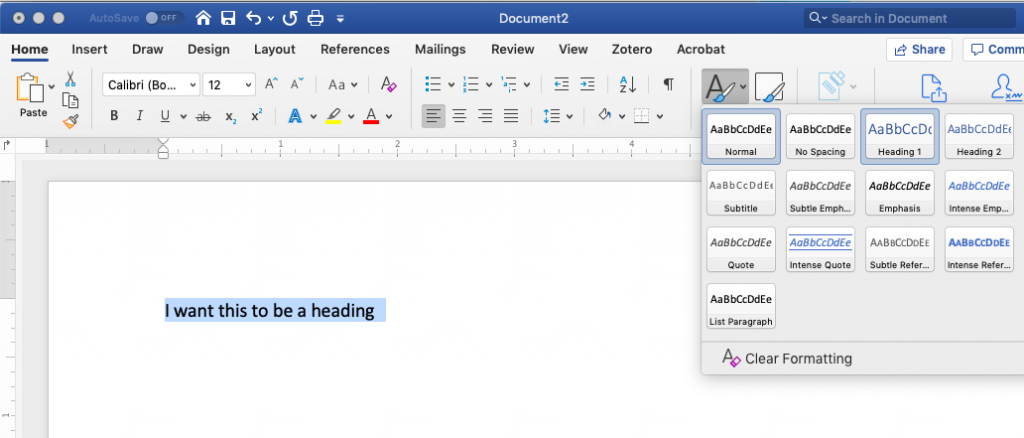
Click on the “Styles” panel at the top of your document or search for the word “Styles” in the help bar.
From there, you should have the option to select, edit or create headings or other formatted styles. Tag the highest-level heading with Heading 1, sub-sections with Heading 2, and sub-sections of sub-sections with Heading 3. Label body text Paragraph.

To create effective, accessible headings in Canvas:
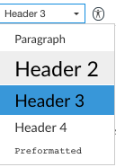
Use the Text Editor to tag sections with Heading 1, sub-sections with Heading 2, and sub-sections of sub-sections with Heading 3. Label body text Paragraph.


Listen To A Screen Reader In Action
The video below captures the Mac Voiceover function reading one of our course pages. In it, the screen reader describes page components aloud, something that is especially apparent when the voiceover includes the words “Heading Level 3” in the title and when it describes the “Curb Cut” image.
This video includes a screen reader rendering of a page about Universal Design.
For an overview of an experienced user’s everyday screen reader workflow, visit this video about screen readers.
The WebAIM website provides information about how to evaluate a page’s screen-reader accessibility by using VoiceOver (a built-in component of Mac laptops) or NVDA (Windows) to listen to that page’s content. If you are someone who has minimal experience with screen readers, I’d encourage you to try enabling voiceover on a device and trying it out for a while. This will help you to understand and anchor web accessibility principles related to structure and organization.
Media Attributions
- Ann: Original artwork by Hilda Anggraeni (BCcampus). © Creative Commons Attribution 4.0 International Licence.
- Jacob: “WFE003: Jacob” by Rosenfeld Media. © Creative Commons Attribution 2.0 Generic Licence.
This adaptation of BCcampus Accessibility Toolkit: 2nd Edition is licensed under a Creative Commons Attribution-NonCommercial-ShareAlike 4.0 International License. This means that you should feel free to adopt and adapt content from this page for your own teaching, but we ask that you observe the terms of the license (linked above) and that you provide attribution to Sue Bauer, John Raible, and Jessica Tojo of UCF, The UW-Madison Collaborative for Advancing Learning and Teaching, and UW-Madison Learning Support Services

