Main Body
Web Design
Taking down unprofessional content and replacing it with material that accentuates your professional credentials may be enough to ensure that your online public profile does no harm. However, you may consider building a personal website to flesh out your professional interests, boost your online public profile, and help you stand out from the crowd. But before we explore how to publish a website, it is essential to introduce the basics of web design.
Establish the purpose of your website
Above all it is crucial to recognize that a website is not an end unto itself. It is but a means by which to facilitate your own professional development, and is but one part – albeit a big part – of your overall web presence. Remember, this as your are building your website. This is not an art project, nor should it be dedicated to your pets or personal hobbies. The singular purpose of your site is to improve your online professional profile and maximize your employability.
Focus on your intended audience.
Your website’s form and function should be organized to provide others with a better picture of your professional training, interests, achievements, and maybe a bit about you personally. Furthermore you should design your website so that potential employers (or professional collaborators) can easily locate the qualifications and skills that are most relevant to them. Thus, in many ways, the best professional websites are interactive resumes. Applying to a job that values communication skills and creative thinking? Include a page that focuses on your writing. Considering a job with an NGO? Create a page highlighting your volunteer work. If you organize and build your website properly, you’ll not only provide visitors with a comprehensive picture of your professional self, you will do so on a platform that allows visitors to customize their experience.
Web Design
To convey all that great information about yourself, you need to make it easy for your readers to find the information they want. This is where web design comes into play. Website design is a creative process, one that says a lot about you, and communicates to your audience how you want to be seen publicly. No one can tell you exactly what your site should look like – but there are some practices and strategies that are better than others.
Content
“Usability and utility, not visual design, determine the success or failure of a web-site.”[1]
The most important aspect of web design is the quality of the website’s content. Therefore, before you ever think about how the website will look, decide what key information you need online, and how it should be organized. Use past job applications and a current c.v. as guides to help get you started.
At a minimum, you should include the following:
1. A paragraph that introduces yourself and your professional interests.
2. At least one picture of you, so that people can associate your face with your name.
3. Contact information.
4. Qualifications or professional interests. For example, you may want to include a page dedicated to each of the following: current research, teaching experience, teaching philosophy, example assignments, professional service and awards
5. Finally, it is okay to include personal information (about your hobbies, interests, and family). They round you out as an individual. However, keep the focus on you as a professional.
Be concise
“Web users are impatient and insist on instant gratification.”[2]
This dictum is not only true for most internet users, but potential employers. In today’s job market, employers often sift through hundreds of applications for a single position. If a member of a hiring committee happens to navigate to your website, they only have a limited amount of time to look at it. So, make it obvious as to what is important. Remember: The harder your website is to navigate, the less information about you potential employers will see.
Remember that users don’t read internet content, they scan it.
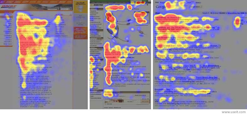
Even if your web-site is well-designed and contains great content, few people will read everything you include, so make certain that the important information is at the top, that it stands out, and that the page has a few fixed points or “anchors” that will help guide visitors.

Above are three “eye maps.” Each chart illustrates how the average reader examines web content.[3] In these “eye maps,” the areas on a website that people tend to focus most intently upon are the reddest. The charts then fade to yellow and blue over those areas people glance at less.
Look at each of the three examples carefully. See how viewers read the top few lines intently and then scan less and less the further down the page they go. You’ll notice that the map’s most viewed regions are shaped like an “F”. Remember this for your own site. Most people will only read the first few lines and then scan the rest of the document. Thus it’s essential that you capture their interest quickly and make it easy for them to navigate to other pages of interest.
Beware information dumps
Make certain you don’t overload each webpage with too much material. Break your pages up so that each page covers a particular concept. If you overload a page with information the stuff on the bottom half will be ignored.
Stay relevant
Finally, it is essential that you keep you page current. It is better to take a website down, than to keep it up with outdated and potentially misleading information. It is never enough to simply have professional and positive information about yourself on a website, it must be up-to-date.

