
Biocore Statistics Primer
Chapter 2: Examining and Understanding Your Data
Section 2.1: Types of Variables
It is important to distinguish the types of variables with which you are working, because the type of data influences the kinds of analysis and the presentations that are most appropriate (Fig. 2.1.1).

Almost all data that you will obtain will fall into one of two types—quantitative (numerical) or qualitative (categorical). Table 2.1.1 provides some concrete examples of quantitative and qualitative data.
| Quantitative (Numerical) | Qualitative (Categorical) |
| Plant leaf area in square centimeters (continuous) | Plant leaf type: toothed, entire, divided, lobed |
| Level of enzyme activity estimated by product light absorption (continuous) | Drosophila fly gender: male or female |
| Worm movement speed in mm/sec (continuous) | Worm movement type: paralyzed, slow, normal |
| Yeast cell diameter (continuous) | Yeast cell shape type: budding, unbudded, shmooing |
| Number of coneflowers, rosinweed and lupine in a prairie quadrat (these represent 3 different discrete variables, one for each species) | Species identity for plants found in prairie: coneflower, rosinweed, lupine |
Quantitative (Numerical) Variables
These include numerical data that are either continuous or discrete.
- Continuous variables are measured with a numerical value and the units of measurement can be infinitely subdivided (at least to the resolution of the measuring instrument). For instance, if you were measuring the amount of rainfall for a given summer, and your equipment allowed resolution to the nearest one hundredth of a centimeter, you might record 52.34 centimeters of rainfall. However, if your resolution was only to the nearest centimeter, you would record 52 centimeters.
- Discrete variables are ones that can only take on certain fixed values. The most common type of such variables takes on whole number values. For example, if you were counting the number of coneflowers in a given plot, your data would only consist of whole numbers (e.g., you could not have 10.5 coneflowers, only 10 or 11 coneflowers).
Qualitative (Categorical) Variables
These include data for which the "observed response" is a category. Categorical data can be further divided into two subgroups — ordered and unordered. If you are recording plant leaf type, with categories (a) toothed, (b) entire, (c) divided, and (d) lobed, the categories are considered unordered. If you are looking at the state of disease on leaves with categories (a) heavily diseased, (b) slightly diseased, and (c) healthy, these categories are ordered. (Analysis of ordered categorical data is quite complicated and we will not consider such data further in this Primer. Methods appropriate for unordered data can be used for analyzing ordered data; however, they may not be able to provide as much statistical support for some scientific questions as more complicated methods.) Henceforth, when we refer to qualitative data, we will assume that they are unordered.
For the leaf type example, the actual data would consist of the type (a category) for each individual leaf in your sample. Thus, for example, the recorded data for a given leaf might be "lobed". There is a numerical aspect to such data; this is the number of leaves of each type. The numbers of each type will be important for analysis; however, it is important to keep in mind that such data are categorical and the numbers represent a "summary statistic".
If you are having difficulty in deciding on the type of data you have, think in terms of a single observation — say a leaf. If the observation is denoted by a number, say, leaf area, then the data are quantitative. If the characteristic of the observation is a category, say, leaf type, then the data are qualitative.
A student might well ask about the difference between the entries in the two columns for the last row of Table 2.1.1. If one is interested in the number of plants of a given species in a quadrat, there would be no need to consider categorical data. However, suppose one wished to screen a large number of quadrats and one was only interested in determining which (if any) of the three species was present in the quadrat. Then it makes sense to think of the variable as categorical. The "quantitative aspect" of these data could be the number of quadrats in which a given species appeared or, perhaps, the number of quadrats in which a particular two species both appeared..
Section 2.2: Examining Raw Data — Plots for Quantitative Data
The first step in data analysis should always be a careful examination of your spreadsheet to look for data entry errors, unusual patterns and trends. This gives you an opportunity to see that the data “make sense” and to make some preliminary interpretations. Careful "notes" written in your research logbook, as you collect data, can be very helpful in data examination. For instance, if you suspected that a particular instrument was not working properly (maybe a battery was running low), a note in your logbook can help you determine if a given data point is "real" or potentially anomalous.
Plots
When you have gathered data from a biological study, avoid the temptation to jump straight to performing inference (e.g., conducting statistical tests of your hypotheses regarding population values). Always look at your raw data first!!
Plot your raw data, in multiple ways if possible. A good plot can help you spot errors before they creep into more formal analyses. Also, all formal statistical inference is based on underlying assumptions. An initial examination of your data can help you to spot possible violations of key assumptions.
Plotting the data — often in multiple ways — should always be the first step in any analysis.
Visual representations of raw data can yield valuable information about the population of interest.
Plotting Data from One Variable
Suppose that you want to examine patterns in the heights you have measured from 18 randomly selected lupine plants in the Biocore Prairie. You would need plots appropriate for single quantitative variables.
Consider Table 2.2.1 which shows sample height data (measured in centimeters) for these 18 lupine plants.
| 73 | 83 | 79 | 56 | 87 | 65 |
| 47 | 96 | 90 | 78 | 63 | 75 |
| 52 | 103 | 64 | 89 | 76 | 68 |
Stem-leaf displays, histograms and box plots are three useful types of plots for data like these. We discuss each here.
Stem-leaf display
Stem-leaf displays provide a visual pattern of the data distribution including the shape along with an indication of central tendency and variability. Stem-leaf plots can be constructed quickly by hand (for small and medium-sized data sets) and contain all of the raw data!
For the plant height data in Table 2.2.1, the data range from 47 cm to 103 cm. For these data, our "stem" will be the number in the "tens" place and our "leaf" the number in "ones" place. In Figure 2.2.1 the data are entered, in the order of Table 2.2.1, going down each column. From this stem-leaf plot, we can see that most of the plants in this sample have heights between 60 and 90 cm.
 4 | 7
 5 | 26
 6 | 4358
 7 | 39865
 8 | 397
 9 | 60
10 | 3
Figure 2.2.1: Stem-leaf plot #1 for lupine plant heights (in cm) in Table 2.2.1
In some cases scientists might wish to see the raw data sorted into fewer categories. This can be done straightforwardly with stem-leaf plots. For the plant height data, the default stem command in "R" produces the plot shown in Fig. 2.2.2. (Note that, for example, the "6" row contains all of the lupine plants that have heights between 60 and 79 cm. Also note that R automatically orders the data.)
 4 | 726
 6 | 345835689
 8 | 37906
10 | 3
Figure 2.2.2: Condensed Stem-leaf plot #2 for lupine plant heights in Table 2.2.1
Histogram
Particularly with larger data sets, stem-leaf plots may not be the best way to visualize key patterns of interest to scientists. Histograms can be particularly useful in such cases because they provide easily interpreted visual depictions of the distribution of the data including indications of central tendency and variability. The histogram in Fig. 2.2.3 shows the frequency of lupine plants found in each of several height ranges, or "bins". Note that the sum of the frequency counts for each bin range is equal to the sample size of 18 plants. This histogram immediately tells us that the majority of lupine plants were between 60-90 cm high, with just a few plants that were outside of this range. The visual pattern is similar to that of the stem-leaf display shown in Fig. 2.2.1 — rotated by 90o. Note that the individual data values are not available in a histogram.
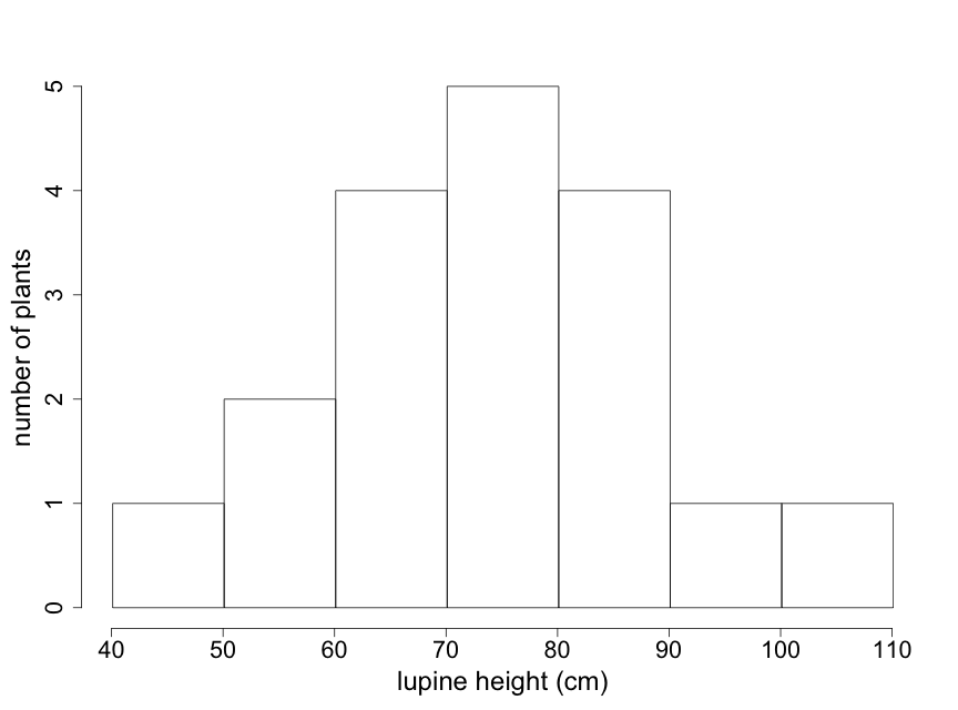
The appearance of a histogram can vary depending on where the boundaries between "bins" are drawn. Particularly with small data sets, interpretation of a histogram needs to take this into account. (Note that for the lupine data, the value of "90" is placed in the 90-100 bin. Different histogram programs might place it in the 80-90 bin.) Try to construct at least 2 or 3 different histograms of your raw data, using different bin boundaries, to understand the sensitivity to bin boundaries and to select the one that best describes your data.
Box Plot
Box plots are coarser summaries of histograms but they provide easily visualized information on the shape, again with an indication of central tendency and variability (Fig. 2.2.4). The bold line in the center of the box is the median of the data — the value for which half of the data points are larger and half are smaller. The upper and lower boundary lines of the box indicate the upper and lower quartiles. The upper quartile is the value for which one quarter of the data points are larger and the lower quartile is the value for which one quarter of the data points are smaller. The bottom and top lines extending beyond the box indicate the smallest and largest of the data points, respectively, and thus represent the sample range.
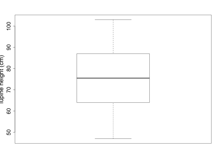
Scientists are often curious about whether there are consistent, measurable differences between two (or more) different samples. For example, imagine that you notice that many lupine plants seem taller than other plant species you've observed in the Biocore Prairie . You wish to explore and compare the heights of several distinct species of prairie plants. Side-by-side box plots are an excellent tool for providing a quick visual comparison for a number of groups.
An important comment on axis scales
Note that the standard box plot (pictured in Fig. 2.2.4) and the standard scatterplot (illustrated below in Fig. 2.2.7) have x and y-axes that generally do not start at 0. The default settings of many graphics programs lead to plots that scale the axes to the actual range of data. Always ask yourself whether the automatic scaling makes sense for the story you want to tell with your data. For example, suppose you wished to use box plots to compare the heights of two species of lupine. In such a case it would make good sense for the y-axis scale to begin at zero so that readers can decide for themselves how meaningful the differences are between the groups. Thus, scientists must take scaling into account before interpreting any data plot! (In some later plots, we will present examples where the axes scales are chosen to best tell the desired story. See, for example, Fig 5.2.1.)
Section 2.3: Using plots --- while heading towards inference
Scientists use sample data to make inferences about populations. We provided some discussion about this in the previous chapter. Stem-leaf displays, histograms, and box-plots can be helpful in anticipating and informing such inferences. If your sample is indeed representative of the population, the observed shape and indication of central tendency and variability from your plots should give you some meaningful understanding of your population.
Scientists also use sample data plots to assess whether important assumptions about the data have been met. It is necessary that data assumptions are met for the inference to be valid. This includes the assumption of normality (i.e., the assumption that the data follow a symmetrical bell-shaped curve, or normal distribution (Fig. 1.4.3)). Many populations in the natural world tend to follow, at least approximately, a normal distribution as described in the previous chapter, although many do not.
The use of plots to assess normality
Data have been obtained on the Galapagos finch, Geospiza difficilus septentrionalis, also known as the sharp-beaked ground finch or Vampire finch (since it has the unusual adaptation of pecking under the feathers of red-footed or Nazca boobies and drawing blood). The finch beak height data (i.e., the height from the top or "dorsal" beak surface to the bottom or "ventral" beak surface) tell us something about the ‘sharpness’ of the beak. Here we use a histogram (Fig. 2.2.5) to examine the beak height data (in mm) from 83 randomly selected finches of this species.
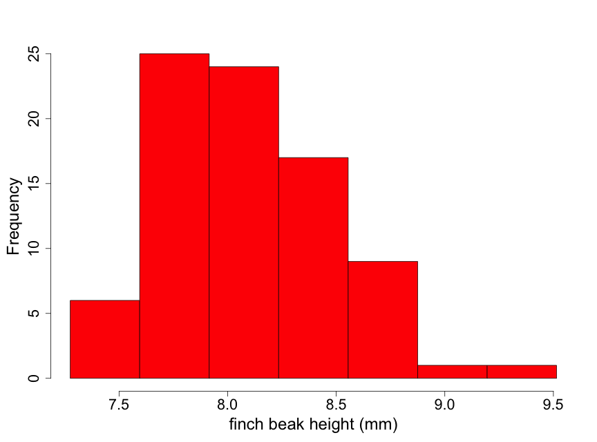
Although these data are unimodal, they demonstrate a lack of normality due to some skewness to the right. This means that there is a longer "tail" of data towards higher values than towards lower ones. We describe this by stating that the beak height data are skewed to the right of the center of the distribution of beak heights. Thus, inference based on the assumption that the data are normal may not be appropriate here. One possible approach for conducting inference in such a situation is to find a transformation of the data (such as square root or logarithm) that makes the distribution appear approximately normal. We illustrate this by taking the logarithm of the beak heights (Fig 2.2.6).
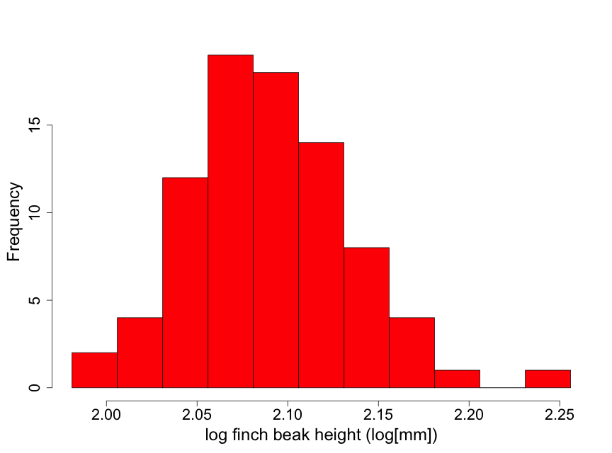
The transformed data appear considerably closer to a normal distribution. There is one observation that is a bit on the large size. However, this is not nearly enough of a concern to question using normal inference with the log height data.
A Caution: Scientists need to carefully consider the biological interpretation of statistical analyses using transformed data. For example, this can be an important issue with confidence intervals (introduced in Chapter 3.) If confidence intervals are constructed using the log of beak heights, great care must be taken in the proper biological interpretation of such intervals.
In some cases, transformation of non-normal data may be an important step to understanding the data properly. As one example, bacterial population sizes can range dramatically (1,000 fold or more) and are strongly skewed to the right. A log transform of such data allows a more useful visual representation. (There are also some theoretical arguments for looking at the log of microbial populations.) In the bird beak example, the fact that the beaks are curved may indicate that the raw scale is not the most appropriate one. A log transformation may better provide for an understanding of ecological function.
Plotting data from two variables
Sometimes scientists wish to examine potential relationships between two different variables. For example, Galapagos finch biologists might suspect that finches with larger beak heights also have longer upper beaks (i.e., measuring length proximally to distally). Scientists could investigate whether this is true by examining a plot of upper beak length versus beak height (using the raw untransformed data). The data display shown in Fig. 2.2.7 is called a scatterplot.
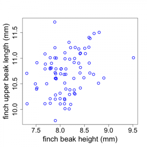
(Note that the x and y-axes represent quantitative variables but do not begin at zero. Also note that sometimes there are two or more data points with the same length and height values. We have used the "jitter" tool In R to depict those here.)
In the Galapagos Finch example, we see that there appears to be a weak trend for finches with larger beak heights to have longer upper beaks but there is a good deal of scatter to the data. (Although the Fig. 2.2.7 scatterplot has two quantitative variables, plots similar to this can also be made when the x-axis is a categorical variable like plot number or replicate number.)
For scatterplots, you need to be aware how the graphics package you use handles the scaling along the axes. See an earlier comment about this in the discussion on boxplots
Section 2.3: Plots for Categorical Data
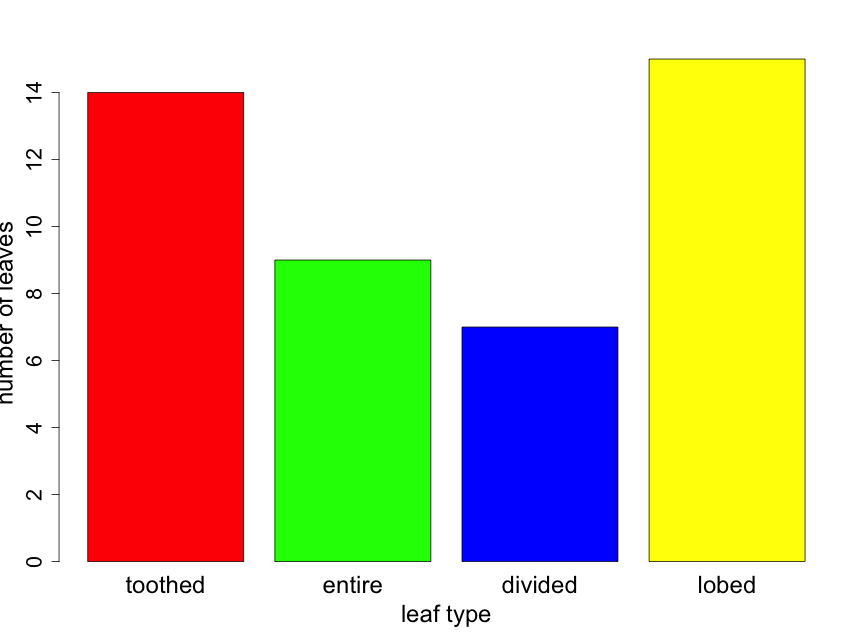
How do scientists construct plots for categorical data to summarize their observations and address their questions? Probably the best way to visualize categorical data — counts or proportions of data falling into distinct groups — is with bar graphs and pie charts. Because statistical inference will require the actual value of counts, all plots with categorical data should provide some indication of sample size.
Suppose that you took a random sample of 45 leaves from trees in a half acre of forest and recorded the leaf type for each. Suppose that you found 14, 9, 7, and 15 leaves that were toothed, entire, divided, and lobed respectively. The resulting bar chart would appear as follows (Fig. 2.3.1). Here the reader can calculate sample sizes for each leaf type category by carefully examining the y-axis scale.
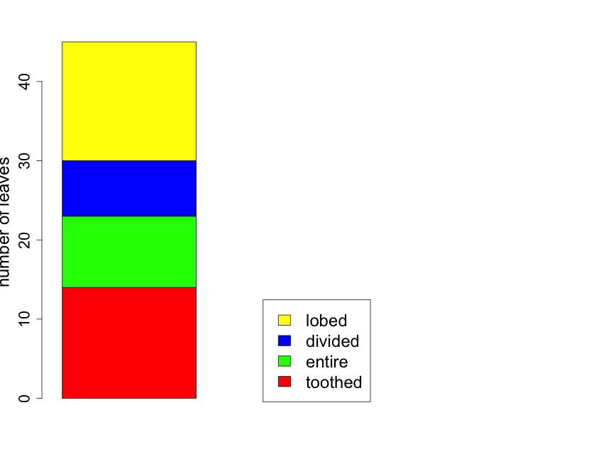
If one is interested in comparing the proportion of leaves of the various types from two or more forest locations, it can be useful to construct the bar plot as a "stacked" barplot. In Fig. 2.3.2 we illustrate this for the same data shown in Fig. 2.3.1, but now displayed as just a single sample with sample sizes indicated in the figure legend. Later in the primer, we will use the technique for comparing proportions across several groups.
Section 2.4: The Importance of Plotting
Let us repeat a key point of this chapter. A visual representation of the raw data from a representative sample can yield valuable information about the population that you are trying to study. Plotting the sample data — often in multiple ways — should always be the first step in any analysis. If your sample is indeed representative of the population, the distribution of the data will mirror that of the population. With careful attention to study design and data collection, your sample should properly describe the population. Assuming good design and careful data collection, in general, the larger the sample size, the better your sample will mirror the population.
Section 2.5: A Brief Comment about Assumptions
We have already indicated that all methods of statistical inference have some underlying assumptions. For example, as noted above, plots of data can be very useful in assessing whether or not the data follow, at least approximately, a normal distribution.
Earlier, we focused on the key role played by statistical independence. It is usually very difficult (if not impossible) to assess this assumption only by an examination of the data. In a few cases careful plots can be helpful in assessing independence. Suppose that you are using a spectrophotometer to measure the amount of light absorbed as it passes through a blood plasma sample. In taking measurements over time, there might be some drift in the spectrophotometer device or the device does not accurately reset to 0 between measurements. In such cases, the resulting data would not be independent.
Similarly, plots of ecological data in a spatially explicit manner could reveal a lack of spatial independence. For example, suppose you were measuring soil temperature at 5cm below the surface. If your sampled data points are too close together, they may not be independent. A careful plot of soil temperature on a surface map could indicate if there is a problem with independence.
However, for assessing independence, the best tools are careful evaluations of the study design, study conduct, and data generation. These should be undertaken with every study!
Section 2.6: Descriptive (Summary) Statistics
After plotting your data, it is helpful to provide some summary (descriptive) statistics for your data. These provide sample quantities that you will use to estimate important characteristics of the population to which you want to make inference. For example, recall the data in Table 2.2.1 representing the measured heights of 18 randomly selected lupine plants in the Biocore Prairie. The plots provide useful visual descriptions of the data. However, we will also wish to calculate key summary values, such as the sample mean, that we will use for inference.
With a random sample of size n, it is convenient to label the data values as y1, y2, …, yn. (The importance of randomized samples was stressed in the previous chapter.) The most common measure of central tendency is the mean (called y-bar), or numerical average, calculated for a sample of data using the formula:
[latex]\overline{y}=\frac{1}{n}\sum_{i=1}^ny_{i}[/latex] .
Another measure of central tendency is the median. This is the middle value of the data when ordered from smallest to largest. (If there is an even number of data points, the median is the average of the two middle values.) For the data on heights of lupine plants in Table 2.2.1 (and also in Fig. 2.2.1),
[latex]\overline{y}=74.67[/latex] and
[latex]median(y)=75.5[/latex] .
(As noted earlier, the solid line in the middle of the box-pot is the median; see Fig. 2.2.4.) When the distribution is reasonably symmetrical, the mean and median are close together which is the case shown in Fig. 2.2.4. The mean lupine height of 74.67 cm is less than 1 centimeter away from the median lupine height of 75.5 cm. This 1 cm is a very small difference given that the 18 sample plants ranged in height from 47 cm to 103 cm. What does this tell you about how evenly distributed the sample data points are around the average value of 74.67 cm?
A common measure of data dispersion, or spread, is the standard deviation. This is calculated as follows:
[latex]s=\sqrt{\frac{1}{n-1}\sum_{i=1}^n(y_{i}-\overline{y})^{2}}=\sqrt{\frac{1}{n-1}\left(\sum_{i=1}^ny_i^2-\frac{1}{n}(\sum_{i=1}^n{y_i})^2\right)}[/latex] .
The first expression is the definitional formula and the second is the formula that should be used for hand calculation. For the lupine plant height data,
[latex]s=15.28[/latex] .
The units of standard deviation are the same as the units of the original data, centimeters in this case. One interpretation of the standard deviation is as the magnitude of a "typical" deviation. Referring to the plot of the lupine height data in Fig. 2.2.1 (or Fig. 2.2.3), we can see that a height of about 75 cm is near the center of the sample distribution and that +/- 15 cm appears reasonable as a "typical" deviation from this central height.
Another commonly used statistic (function of the data) is the variance. The variance is the square of the standard deviation.
[latex]s^2=\frac{1}{n-1}\sum_{i=1}^n(y_{i}-\overline{y})^{2}[/latex]
For the lupine height data, [latex]s^2=233.53[/latex]. The units for the variance in this case are centimeters squared (cm2). The variance does not have as direct an interpretation as the standard deviation. However, it is a measure that is important for use in inference.
The sample mean ([latex]\overline{y}[/latex]) and sample standard deviation (s) are estimates of the corresponding population mean and population standard deviation. For example, the mean and standard deviation for our sample of 18 Biocore Prairie lupine plants are used to estimate the mean and standard deviation for the entire population of lupine plants at the Biocore Prairie. In the real world, you will never know the population (true) values. However, if your sample is a random sample from the population of interest, you will be able to use sample estimates to make reliable inference about the population.
Summary statistics — based on random samples — allow us to estimate important characteristics of the population in which we are interested. (For example, the sample mean, [latex]\overline{y}[/latex], is used to estimate the true population mean, [latex]\mu[/latex].)
Section 2.7: The Standard Error of the Mean
Remember that the primary reason that scientists sample is to increase the precision with which they can estimate population quantities of interest. Let us think of the sample mean, [latex]\overline{y}[/latex], as estimating the population mean, [latex]\mu[/latex] (the Greek letter mu). It is important to know how close [latex]\overline{y}[/latex] is to [latex]\mu[/latex]. The quantification for this is known as the standard error of the mean (SE). This is expressed as follows.
[latex]SE=\frac{s}{\sqrt{n}}[/latex] .
For the lupine plant height data,
[latex]SE=\frac{15.28}{\sqrt{18}}=3.60[/latex] .
As we can see, the standard error decreases as the sample size increases. Thus, as the sample size gets larger, we are able to estimate the value in which we are interested — the true mean height of all lupine plants in the Biocore Prairie [latex]\mu[/latex] in this case — with more precision.
Larger sample sizes give us more precision. No matter how large the underlying variance (or standard deviation) of the variable of interest is --- lupine plant height in this case --- we can achieve the precision in estimation that we wish to achieve by increasing the sample size.
In the real world, we will need to balance desired precision with cost of sampling. For example, in measuring heights of lupine plants in the Biocore Prairie, how precisely do you wish to estimate the mean height and how much time (or resources) do you have to take the measurements?
It is important to distinguish between standard deviation (s) and standard error of the mean (SE). Just as every population has a true mean, every population also has a true standard deviation (or variance). With a sample size as small as 2 (see the formula for standard deviation) we can estimate the true (population) standard deviation with the sample standard deviation, s. Clearly with a small sample size, our estimate will be highly variable. Nonetheless, regardless of the sample size, our s is an estimate of the true population standard deviation. The variability in the estimate of s will decrease as the sample size increases. However, for any value of n, the formula for the sample standard deviation provides an estimate of the true (population) standard deviation. Thus, for the lupine height example, our estimate of the population standard deviation is 15.28 cm. With a different sample of size 18, we would get a somewhat different estimate (for the population standard deviation). With samples of other sizes, we would obtain other estimates; however, all of them will be estimating the same true (population) value.
The standard error, on the other hand, is a measure of the precision of our estimate of [latex]\mu[/latex], or some other population value of interest. Regardless, of the the true underlying standard deviation, we will be able to decrease the variability in our estimate of [latex]\mu[/latex] by increasing the sample size. For the lupine example, the standard error is 3.60. Had we taken a sample of size 72, and obtained the same estimate of standard deviation, the standard error would now be 1.80 [latex](=\frac{15.28}{\sqrt{72}}=1.80)[/latex].
Here is another way to think about these concepts. The standard deviation, s, is a measure of how closely individual data points cluster around the mean in any given sample. In contrast, SE is an estimate of the spread of many mean values surrounding the true population mean, as if the study were repeated a large number of times.
Just below is a short video which provides additional explanation on the difference between standard deviation and standard error.
.
