
25 Creating Printable Posters (Technical Details)
Sometimes Biocore teams choose to produce electronic posters and print them using large format printers. See this College Library website for a link to more important information and tips on creating posters in PowerPoint and Photoshop:
http://www.library.wisc.edu/college/services-at-college/computer-lab/poster-printing/
Essential Tips for creating posters in PowerPoint
- Open Power Point– Open a new document – chose the “blank” layout (no pre-existing boxes)
- Size your poster for:
-
- Mini-poster– Go to “File”, then “Page Setup”. Adjust the scale to Letter Paper (8.5×11 inches). If you print this document, the width will be 10 inches and height will be 7.5 inches allowing for a 0.5 inch margin.
- Large format printer – Go to “File”, then “Page Setup”. Adjust the scale to a print size of 48” width x 36” height.
- Create your Title box. Go to your drawing toolbar and click on the text box. Type your title, then adjust font size (refer to font size guidelines below). In the same box you can also add the author names and separately adjust the font size for names and institutional affiliation.
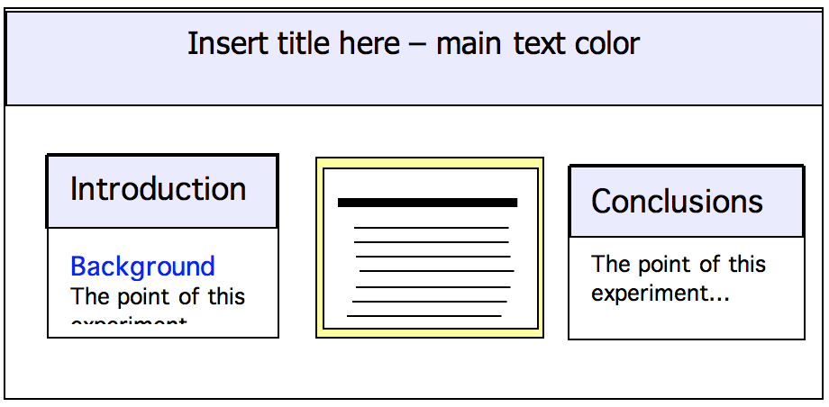
- After that, the process will be mostly about choosing the types of boxes and lines you want to define the areas, orientation and structure of your poster. You have three main types of boxes:
- Textbox
- Shape box
- Figure, table boxes.
Which ones you chose, and how many, will depend on the type of poster you are creating and the parts you will include.
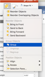
- Align & Group your boxes! Because you’ll have lots of boxes floating around on your slide, sometimes it’s hard to see how well they line up. Make sure your boxes are lined up by holding the shift key while you drag boxes- this will make the red dotted alignment line show up so you can see the alignment of one box in relation to others). Once you have several boxes/ shapes aligned, then group them by selecting Arrange>Group objects from the main menu bar or use the menu icons and select Group as shown to right. Grouped objects can be moved together and will stay aligned relative to one another.
Text box
Click on the textbox symbol in the drawing toolbox and then click on the part of the poster where you want the words (you’ll be able to move it around later so it does not need to be exact). Just start typing. There are two ‘phases’ of the textbox:
- The formatting phase: you can change the entire contents of the box (font, size, centered, rotate, color fill or line color etc.) and move it around. It will look something like this:
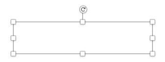
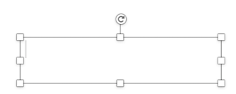
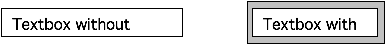
You will be able to click on the boxes on the edge to reshape and resize the box. If you want to move the entire box without reshaping/resizing, just click anywhere else on the perimeter.In addition to changing what’s inside the box you can also change the perimeter and interior. For instance, if your default is set to be white with a black line around it…

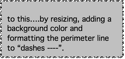
You can change to this, without a line, to…
- The editing phase: the computer lets you change what’s highlighted on the inside of the box. It will look something like this:
Note there is an active cursor inside. In this phase you can highlight and change the style of specific subset of words as in the example above if you have the title and the authors in the same box you could highlight the author names and make them a smaller font.
Shape box
This is a very versatile tool. You can use it for highlighting other boxes, making circles, or making concept maps or graphic models, etc., here’s an example:
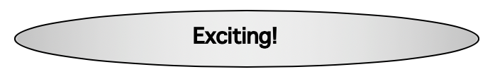
And, if you chose to have a textbox (no fill, no line) in a circle (with gradient fill options), you can do this:
Alignment
All boxes will be automatically positioned on the page along a ‘grid’. This can be good because it can help you line everything up. To manipulate alignment, select Format>Alignment>More Options to reveal a formatting pallet of vertical and horizontal alignment options. Once you have aligned boxes or shapes, group them by selecting the Arrange>Group option from the menu bar (see below).
Arrange/Group Function
Really useful for creating visual diagrams and graphics! When you have multiple levels of boxes (the textbox in front of the shape box) you need to choose which shape will go in front so that your text is not hidden behind the shape. You can do this by clicking on one of the shapes, and right click, then go to “Arrange” or “Order” menu and “bring object front’ or ‘send object back’.
If you get a collection of boxes or objects together and you want them to stay together, you can use the “Group” function by highlighting all the boxes (either shift and click on all of them, or go to the arrow in your drawing toolbox and use it to highlight all of them), right click, go to “Group”. You have the option of ungrouping as well.
Inserting Figures and Graphs
If you’re using data and have a graph from Excel, or another program, you have two options.
- Importing: Directly bringing the figure into PowerPoint from the other program. You can import a figure or table from Excel by “copying” the figure within Excel and “pasting” it into the poster. Sometimes this works. If not, you may have to recreate your figure using the ‘chart’ option provided.
You can also “paste” in several ways. If you will not need to modify your graph you can choose to paste as a screenshot or picture. This will be more likely to paste the graph as it looks in Excel, but you won’t be able to modify colors or numbers. This is also great for tables you don’t want to redo in PowerPoint. To do this, “copy” as usual in Excel, but when in PowerPoint, go to “edit”, “paste special”, then “Picture (TIFF)”.
- You can create a table for graph using PowerPoint’s software: Go to “insert”, click “chart” or “table”. You will have a spreadsheet pop open for the chart, and a dialogue box asking how many rows and columns. You can either enter the values by hand, or, it’s possible to copy and paste your spreadsheet data from Excel into the PowerPoint. The chart function works very similarly to Excel.
General Font Tips
Font size will depend on the font chosen, length of text, AND the size of the poster. Below are for standard Calibri font for a Mini Poster (8.5×11” Letter sized) and Large Format poster 4’ wide by 3’ high that can be viewed from 5’ away.
| Font Size Guidelines | ||
| Sectiion Component | Mini-Poster | Large Format Poster |
| Title | 24 | 85+ |
| Author names | 14 | 50 |
| Section headings (Introduction, Methods etc.) Subheadings |
14 12 |
36 |
| Section text | 9-10 | 24-28 |
| Figure/ Table legends | 8-9 | 16-18 |
| Literature cited | 6-7 | 12-14 |
*Note: Fonts vary in legibility. For mini-posters, adjust your font sizes to be large enough for your instructor to read comfortably from arms-reach, about 24 inches away.
Generally use sans serif rather than serif font for posters. Times New Roman (what most of this manual is written in) is a serif font – it means that the font style has little connectors between the letters – designed to aid the eye as it flows from one letter and word to the next in paragraph form. Sans serif fonts, like Calibri, Arial and Helvetica, do not have these connectors. Below is a phrase in 20 point font for sample serif and sans serif fonts:
and the cow jumped over the moon (Times New Roman- serif font)
and the cow jumped over the moon (Calibri- sans serif font)
For reading lengthy documents, serif fonts are appropriate, but for posters many people feel that, especially for titles and headings, that sans serif fonts are easier on the eye.
General Style Tips
We suggest you chose a light-colored background and dark-colored text, however light (white) text on dark background works well too. Regardless of color choice, make sure your text stands out and is of high contrast from the background. There are many other ways to integrate colors besides the background. You can add pictures, or use colors in your figures, or create colored boxes around different part to emphasize the layout.
Stick with a simple color scheme. Keep it to a maximum of three to four main colors. With four you have a good combination because you have your background, main text color, special text color (– and a variant for your main color), and emphasis color. See below.
| Background color | Light – in this case, white |
| Main text color | Dark – black |
| Special text color | Dark – blue |
| Main color | A variant of your special text – light blue |
| Emphasis color | Contrast with your other colors (e.g. yellow), or add another tone of the main color to create a more monochromatic scheme. |
Love your white space. The blank parts of your poster can offer as much to help with the flow and balance as any of the focal points. Generally, white space can occupy about 20% of your poster space.
Remove all redundancies. If you are using logos (e.g. UW seal or departmental logo) only present it once, rather than as bookends for your title or to fill all of your white space.
Be concise. Although full sentences may be needed in some parts of your poster (e.g. your hypothesis), in other parts keep only essential words and concepts or replace words with visual models, images, or illustrations. Create appropriate abbreviations, acronyms, and symbols that are clearly defined.
|
For examples and good poster design tips visit betterposters.blogspot.com/ |
Your posters will be graded using the rubric on the following page.
