
M1Q1: Thinking Like a Scientist
Introduction
The section explores the real-life topics in thinking like a scientist: representing data, formulating and testing hypotheses, and interpreting results. This section includes worked examples, sample problems, and a glossary.
Before you continue, be sure to visit M1Q0 topics: Measurements, Units, Density; Accuracy, Precision, Significant Figures; and Dimensional Analysis. While these topics should be familiar to you from your previous high school science classes, it is still beneficial to visit these topics.
Learning Objectives for Thinking Like a Scientist:
- Develop and test hypotheses.
| Data and the Scientific Method |
Data and the Scientific Method
Chemistry is a science based on observation and experimentation. Doing chemistry involves attempting to answer questions and explain observations in terms of the laws and theories of chemistry, using procedures that are accepted by the scientific community. There is no single route to answering a question or explaining an observation, but there is an aspect common to every approach: each uses knowledge based on experiments that can be reproduced to verify the results. Some routes involve a hypothesis, a tentative explanation of observations that acts as a guide for gathering and checking information. We test a hypothesis by experimentation, calculation, and/or comparison with the experiments of others and then refine it as needed.
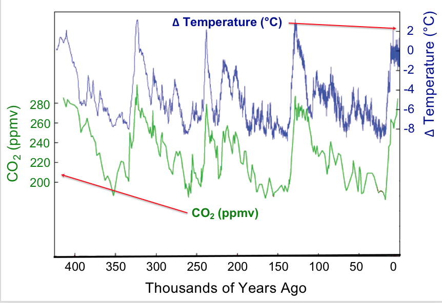
Observation provides the starting point for hypothesis generation. Data that we observe may be presented in tables or various types of graphs. Let’s look at some data concerning global surface temperatures and levels of carbon dioxide, CO2, over many thousands of years (Figure 1). A simple glance enables us to glean many features from this plot. The plot uses double vertical axes with the left-side axis showing CO2 levels as measured in parts-per-million-by-volume (ppmv) whereas the right-side axis shows the change in temperature (ΔT) measured in degrees Celsius (°C). The horizontal axis displays time, with the present at the far right and proceeding back in time to the left. The time span is about 400,000 years. The data shown here could be called the result of a natural experiment; that is data that are produced by natural conditions. Under natural conditions many factors may be changing: the output of the sun, the amount and type of vegetation on earth, the reflectivity of the atmosphere, etc. Strikingly, one sees that increases and decreases in carbon dioxide levels over time are matched by increases and decreases in the mean global temperature; in other words the data are correlated. Does this mean that increased temperature affects increased carbon dioxide levels?
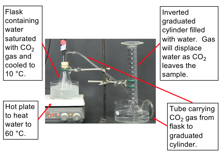
To investigate why the atmospheric carbon dioxide level correlates with temperature we can propose a reason (make a hypothesis) and devise some means of testing our proposal. For example, we might hypothesize that CO2 dissolved in the oceans is released into the atmosphere as temperature increases. How can this be tested? Let’s devise a controlled experiment that addresses this hypothesis. We want to measure how much carbon dioxide is released when a water solution of carbon dioxide is warmed. A setup to make these measurements is shown in the demonstration below along with the resulting data.
Demonstration: Measurement of released CO2 gas upon heating water
Set up. The following video demonstrates the experiment to measure the volume of CO2 released from water upon heating the water. The set-up for the experiment is shown in Figure 2. Make sure to understand the set-up described in the image before watching the demonstration so that you understand what is happening.
Prediction. Now watch the video that displays how the CO2 is collected as the water is heated. You can slow down or speed up the video by clicking on the “1×” in the lower right-hand corner of the video player. Predict what you expect to see while watching the video (e.g., how will you be able to know the gas is being released?).
Explanation. Figure 3 communicates a set of data related to this experiment. Notice the temperature is on the x-axis, and the volume of dissolved CO2 is on the y-axis. A good graph has a meaningful title, axis labels (including units), and a constant scale on each axis. The data is plotted, and a line of best-fit is drawn.
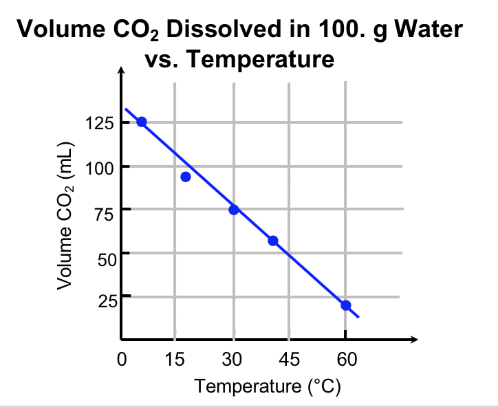
The experiment that we have conducted is isolated from the sun, vegetation, clouds etc., and we have control over the temperature: this is a controlled (as opposed to natural) experiment. Because we set the temperature to the value we desire independent of the release of carbon dioxide, we say that it is the independent variable. By convention we plot the independent variable on the horizontal axis. The release of carbon dioxide is controlled by the temperature. Thus, the volume of CO2 gas dissolved in solution is the dependent variable and is plotted on the vertical axis. The data show that increasing the temperature of water, while controlling other variables, results in increased release of carbon dioxide into the graduated cylinder, and therefore the amount of CO2 remaining in solution decreases.
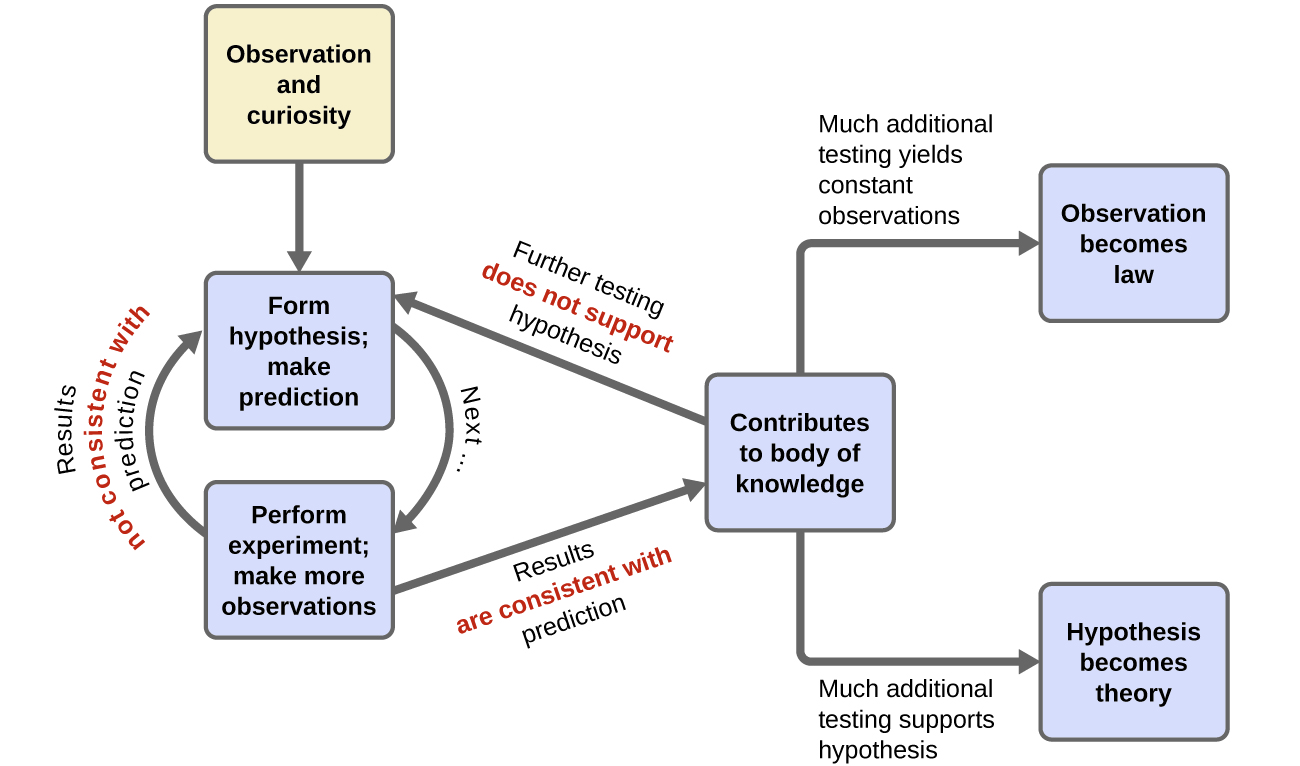
Does this test show that historical trends in carbon dioxide are caused by changes in the earth’s temperature? Or is it the other way around? Or is it neither? A cautious interpretation of our single experiment simply states that it is feasible that changes in the earth’s temperature causes release of carbon dioxide into the atmosphere. As more experiments are performed to test a hypothesis, and as alternate hypotheses are shown to be inconsistent with controlled experiments, confidence in the reliability of the hypothesis grows. Terms such as hypotheses, theories, and laws represent increasing levels of validation and certainty. If a hypothesis turns out to be capable of explaining a large body of experimental data, it can reach the status of a theory. Scientific theories are well-substantiated, comprehensive, testable explanations of particular aspects of nature. Theories are accepted because they provide satisfactory explanations, but they can be modified if new data become available. The path of discovery that leads from question and observation hypothesis to theory or law, combined with experimental verification of the hypothesis and any necessary modification of the theory, is called the scientific method (Figure 4).
Key Concepts and Summary
Scientific advancement is an iterative process. People make observations and generate testable hypotheses. When experiments are completed in the laboratory, it’s essential to have controls. Communication of results often involves graphs with the independent variable on the x-axis and the dependent variable on the y-axis.
Chemistry End of Section Exercises
- What is meant by the phrase “Correlation does not imply causation?”
- Designate the following statements as either a Testable Hypotheses or a Non-Testable Statement:
- Dogs are social animals.
- All people should have dogs as pets.
- A dogs’ sense of smell is more discerning than that of a human.
- Petting a dog releases calming hormones in humans.
- Dog-training programs should be free to all dog-owners.
- Coastal tidal gauge records document the height of sea levels at specific harbor points around the world.
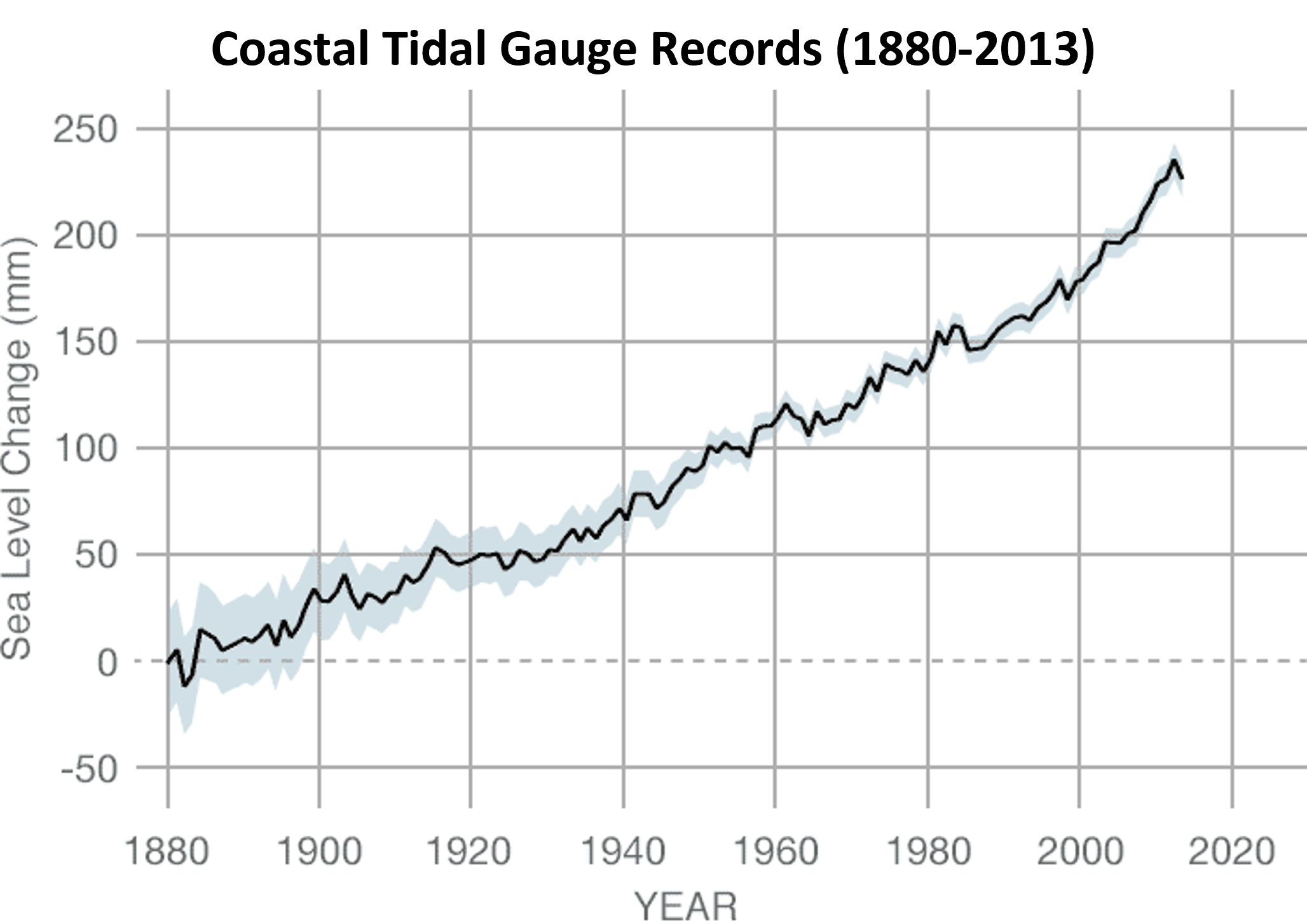
- List the dependent variable.
- Use the graph to estimate the approximate sea level change between years 1900 and 2010 in inches (1 in = 25.4 mm).
- A student is attempting to run 1800 miles this year. Below are two charts of her progress for January, with lines of best fit showing the trend in total distance versus number of days.
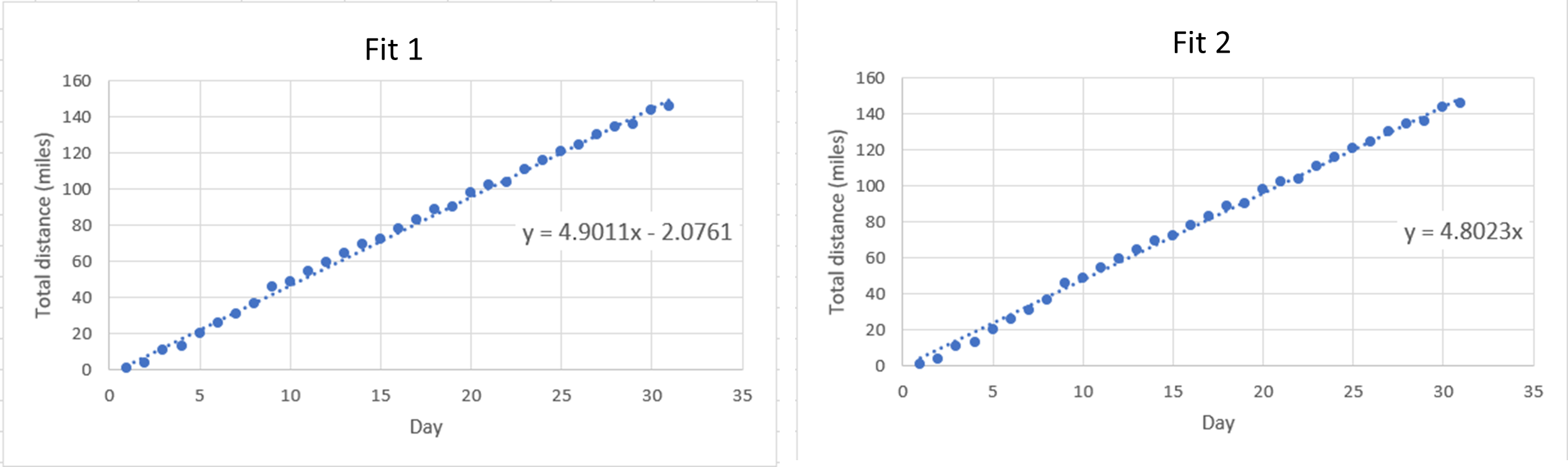
- Which fit is better to use for this sort of data collection and why?
- Using the fit you chose in part (a), determine how many days it will take for the student to reach her goal of 1800 total miles.
- Based on your answers to (a) and (b), will she achieve her goal of running 1800 total miles this calendar year?
- Several salt (NaCl) solutions of varying concentration were analyzed for their density. Use the calibration curve to answer the following questions.
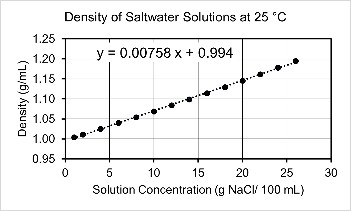
- Based on the graph, identify the independent and dependent variables.
- A sample of water from the Great Salt Lake has a density of 1.18 g/mL. Use the calibration curve to determine the grams of NaCl in a 1.00 L sample of lake water.
- What is the density of pure water at 25 °C? Explain how you used the graph to determine your answer.
- The density of a solution with a concentration of 50 g NaCl/100 mL cannot be determined using this calibration curve. Offer a plausible explanation for why the relationship between concentration and density cannot extend to that range.
- A person is heating a sample of cold water. As she applies heat, she measures the temperature each minute.
- Generate a graph of the following data.
Time (min) Temperature (°C) 1.0 5.0 2.0 10.0 3.0 14.0 4.0 21.0 Find the slope of the line to determine the rate at which the temperature changes.
- If the person continues to heat the water at the rate described above, determine the temperature after heating the water for 8 minutes and 45 seconds.
- Generate a graph of the following data.
Answers to Chemistry End of Section Exercise
- Just because two things change in similar ways does not necessarily mean that one causes the other. (Controlled experiments must be done to see if they are actually related.)
- (a) Testable hypothesis
(b) Non-Testable Statement
(c) Testable hypothesis
(d) Testable hypothesis
(e) Non-Testable Statement - (a) Sea level change (mm)
(b) 7 inches - (a) Fit 2 because it goes through (0, 0); or, you can’t have negative miles on day zero.
(b) Choosing Fit 1: 367.7 days; choosing Fit 2: 374.8 days
(c) No - (a) Independent variable: NaCl Concentration; Dependent variable: Density
(b) 250 g
(c) 0.994 g/mL. The y-intercept of the best fit line is the density of pure water.
(d) Should not extrapolate beyond the data of a calibration curve; the calibration curve will not always be linear (e.g., the salt solution becomes saturated at some point).Left-click here to watch Exercise 5 problem solving video.
- (a) The independent variable is time, so it is placed on the x-axis. The temperature increases as heat is applied for a given amount of time. Temperature change is the dependent variable, so it is placed on the y-axis. The slope of the line is 5.2 °C/min. This means that the temperature of the water increases approximately 5.2 degrees each minute that it is heated.
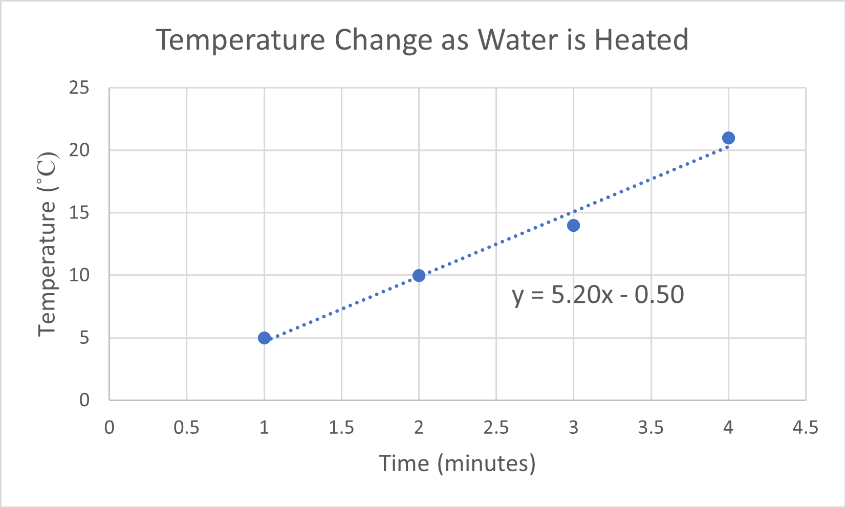
(b) 45 °C
Please use this form to report any inconsistencies, errors, or other things you would like to change about this page. We appreciate your comments. 🙂
